The Delivery Analysis Dashboard is a mobile-friendly dashboard with the same features and functionality as the desktop counterpart. The main idea behind developing this mobile dashboard was to have the key information at your fingertips, ensuring a smooth user experience. It focuses on an accurate narrative structure, keeping the important stuff like KPIs and trends on the first screen, following the Orders, Heatmap, and Report tabs.
It comprehensively analyzes delivery performance based on critical KPIs and trends. Users can monitor Market%, Order Protocol, Delivery Time Heatmaps, and Reports to make data-driven business decisions.
Who Is This Dashboard For?
This dashboard is intended for top stakeholders seeking an in-depth analysis of delivery performance on the fly. Since it’s a mobile-friendly dashboard, several executives can track delivery performance in real-time using their mobile devices.
What You Can Accomplish With This Dashboard
This dashboard has 4 tabs. Users can navigate seamlessly from the bottom menu, just like in a mobile app, and using appropriate and well-balanced color schemes leads to an aesthetically pleasing minimalistic style that enhances the user experience.
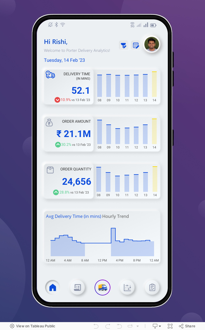
Home The user can obtain a comprehensive summary based on three crucial KPIs and the last 7-day trend. Users can leverage the hourly trend of any KPIs to gain more in-depth insights by just clicking on the KPI icon.
Orders The user can track the Market% based on Order Quantity. This report contains comprehensive details about the Order Protocol based on Order Amount and Growth %. Users can search the top five store categories by delivery time and sort them ascending or descending with a single button click.
Heatmap This tab deep dives into Delivery Time Analysis as a Heatmap. This report combines a heat map and histogram grouped by hours and weekdays. If a user wants to see the data labels, just click on the Label icon to have the values visible.
Report The final tab displays a crosstab report with all relevant dimensions, including delivery time, quantity, and amount. Due to limited space in the mobile dashboard, users can view the following reports via pagination.
Conclusion
We hope you found this Delivery Analysis Dashboard helpful in better identifying which of your stores are driving the most business and which product is most popular.
If you have any questions, need help, or are interested in having a team of Tableau experts design dashboards for you, feel free to reach out!