If you’re looking to monitor the operational burden on your agents and keep a pulse on the performance of your Call Center, this is the Tableau dashboard for you!
Our Tableau call center dashboard makes it easy for you to stay updated on call volume and how those calls are handled.
Who is the Ideal User of This Dashboard?
This call center dashboard example is designed for a call center director or manager who wants to monitor the flow of calls and the level of support delivered.
3 Things You Can Accomplish With Dashboard
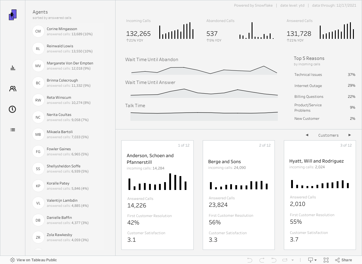
1. Overview
Agent Overview: Use the panel on the left to keep a pulse on top performers amongst employed agents by the number of answered calls. For a deeper dive into agent performance, see the agent tab!
Call Overview: Get insight into key metrics surrounding your call center, such as volume, wait times, and reasons for the call. This view provides a high-level assessment of how these metrics are performing for the current year, with some additional breakdowns of the month-over-month trending.
Customer Overview: View performance cards per customer where you can better understand how much they contribute to the overall volume by month, how their calls are being resolved, and their customer satisfaction rating.
2. Agent Analysis
This tab provides a suite of valuable metrics per each agent while displaying them in a table format that allows the user to compare these values across all agents at the call center.
Freeze for Comparison: One of the key technical features on this tab is the ability to freeze an agent to the top row to easily compare their performance metrics against the other agents. The user simply selects the agent of interest to move them to highlight them and then can continue to view the remaining agents.
Custom Sorting: There are a lot of values of interest represented in this dashboard. To make comparisons and evaluation easier, the user can sort on any of these metrics to adjust the flow of the table.
3. Time Analysis
Change Metrics: The user can toggle through three areas of interest for this analysis. The options include the highest volume, longest talk time, and longest wait time. Understanding peak times for calls and wait periods can help inform staffing decisions to utilize employees better and increase customer satisfaction.
Peak Times: After changing the metrics, the user can view the hour, day, and month with the highest value in the above metrics.
Custom Time Period Heat Map: After picking the metric of interest, the user can choose between a few time period options to better understand the intersection of hour, day, or month where peak values exist.