As new tools emerge in data analytics, teams often migrate from legacy platforms to modern solutions for better performance, scalability, and ease of use. However, during such transitions, users naturally expect Similar experiences, especially regarding how dashboards behave.
One commonly expected feature is the ability for visuals to interact with each other. For example, clicking on a summary value filters or updates another visual in the same view. This behavior is native in tools like Power BI and Tableau, but not built into Sigma Computing by default.
In this blog, we’ll show how you can simulate visual interactions in Sigma using Actions and Sequences, creating interactive, dynamic, and intuitive dashboards.
How Sigma Enables Visual-to-Visual Interactions
Sigma provides the flexibility to define Actions and chain them together using Sequences. These allow you to apply custom logic and trigger modifications on visuals based on user interactions such as clicks or selections.
By leveraging this feature set, we can change one visual trigger to another, enabling a smooth, interactive experience where visuals effectively communicate with each other, just like in traditional BI platforms.
Real-World Use Case: What We’re Building
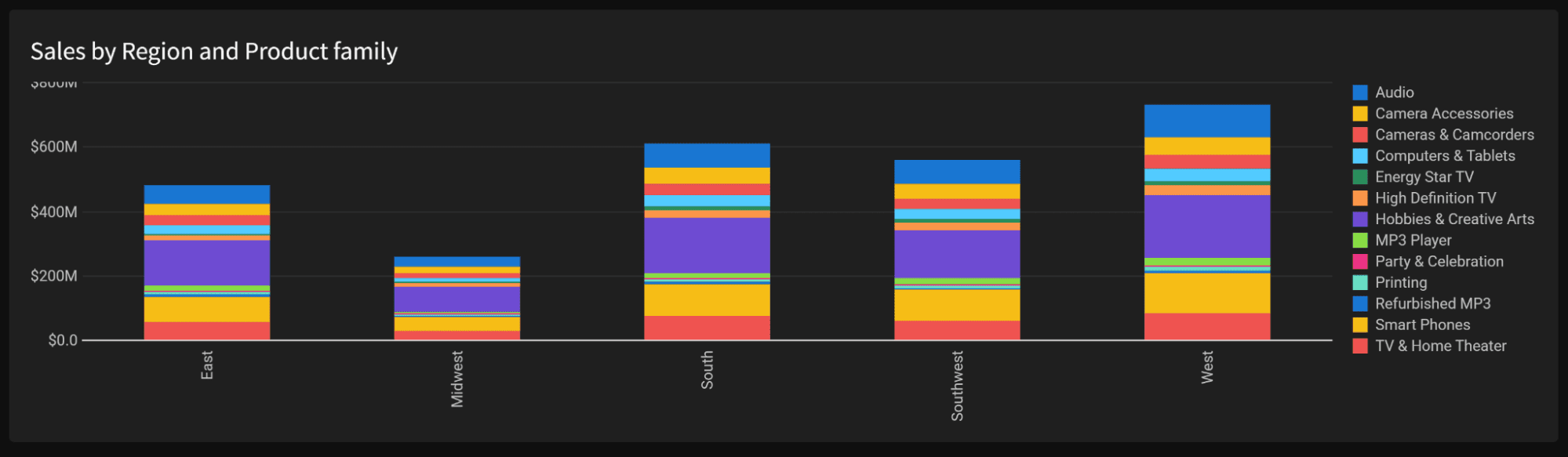
Imagine you have a bar chart showing Sales by Region, with the Product Family used as the legend to break down each bar. Below that, there’s a detailed data table containing the raw sales records, including Region, Product Family, and other attributes.
The goal is to enable the following interaction:
When a user clicks on any bar or legend item in the chart,
The Detail table instantly updates to show only the related sales records based on that selection.
This kind of visual interaction is not natively available in Sigma, but we can build it ourselves with actions and sequences.
In this blog, you’ll learn how to implement this interactivity using Sigma’s built-in features — no code, just smart configuration.
Implementation: Visual Communication with Actions & Sequences
Before jumping into the detailed steps, let’s quickly understand how this will come together:
We’ll use Controls, Actions, and Sequences in Sigma to enable interaction between visuals.
First, we’ll create controls (selectors) for each dimension used in the bar chart — in this case,
RegionandProduct Family.Then, we’ll set up the detail table to respond to these controls.
Next, we’ll configure actions on the bar chart so that clicking on a specific bar (e.g., East region and Software family) triggers a sequence that sets the appropriate values in the controls.
As a result, the detail table will dynamically filter based on the selected bar.
Finally, we’ll add a reset button to clear all selections and return the dashboard to its default view.
Step 1: Build the Bar Chart (Sales by Region with Product Family)
Start by creating a bar chart in Sigma using your sales dataset
X-Axis →
RegionY-Axis →
Total SalesColor / Legend →
Product Family
This setup will give you a stacked bar chart showing sales broken down by product family across each region. This chart will act as the interactive trigger in our visual communication flow.
Step 2: Create List Controls from Detail Table Columns
Start by creating two List Controls — one for Region and one for Product Family.
Use the columns directly from the Detail table as the source for these controls.
This ensures that the control values stay consistent with the detailed view’s data.
Next, link both controls to the Detail Table as their target:
Configure filters so that when a value is selected in either control, the detail table updates accordingly.
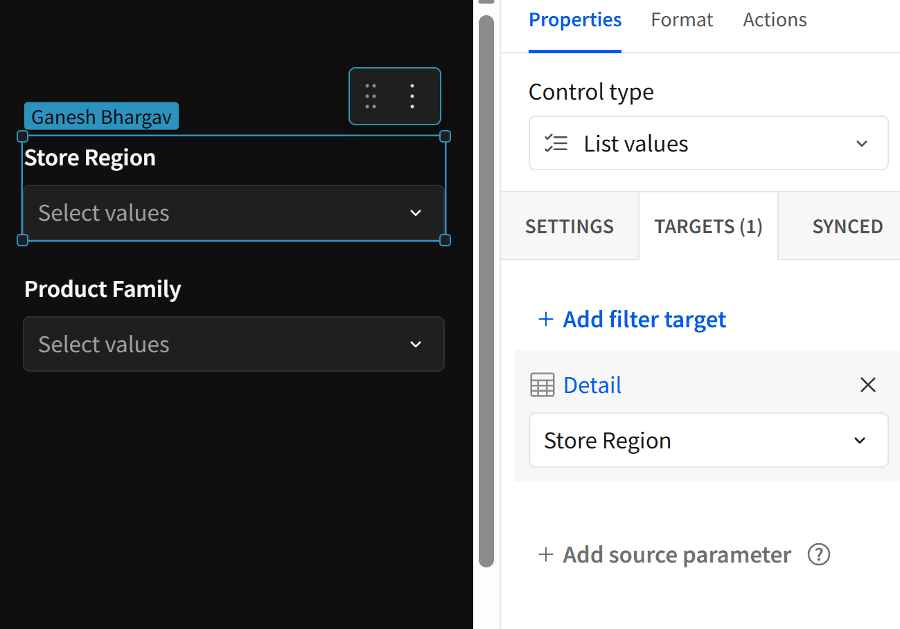
These controls will bridge the bar chart and the detailed data, enabling us to drive filtering dynamically.
Step 3: Configure Actions on the Stacked Bar Chart
Now that your controls and detail table are ready, make the bar chart interactive using Sigma’s action sequences.
Click on the bar chart, then open the Actions tab.
Under On select, click Add Sequence.
Click Add Action in the sequence and choose Set Control Value.
Now, configure the action as shown in the image:
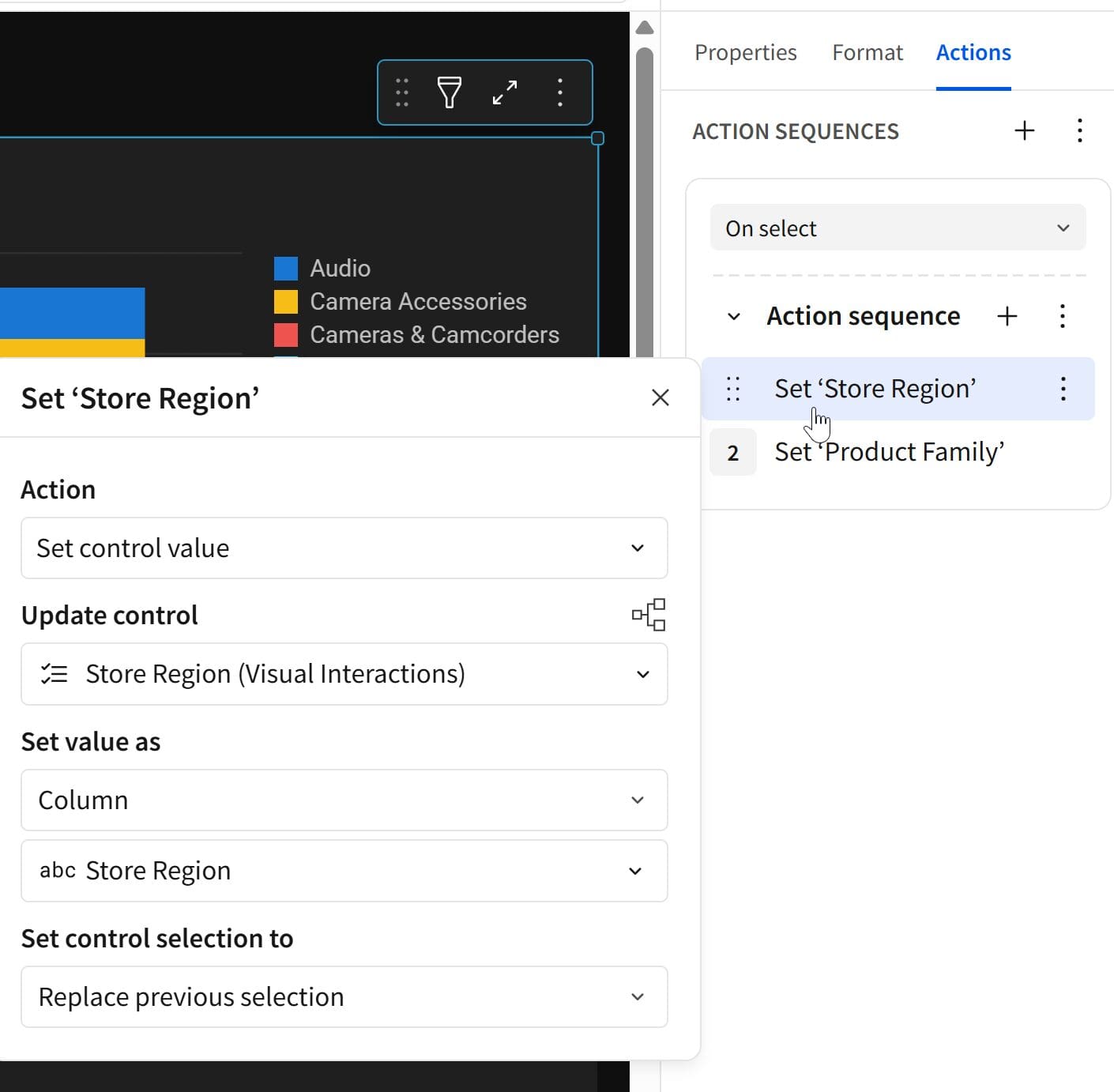
Action: Select Set control value
Update control: Choose the control created for Store Region
(used to filter the detail table)Set value as: Choose Column, then select the Store Region field from the bar chart
(this captures the region from the selected stack).Set control selection to: Choose Replace previous selection
(so each click overrides the last).
When a user selects a stack on the chart (e.g., East region + Software family), the system will look up the East value from the clicked region and set it as the value in the Store Region control, which filters the detail table.
Repeat the same process to configure a second action for Product Family.
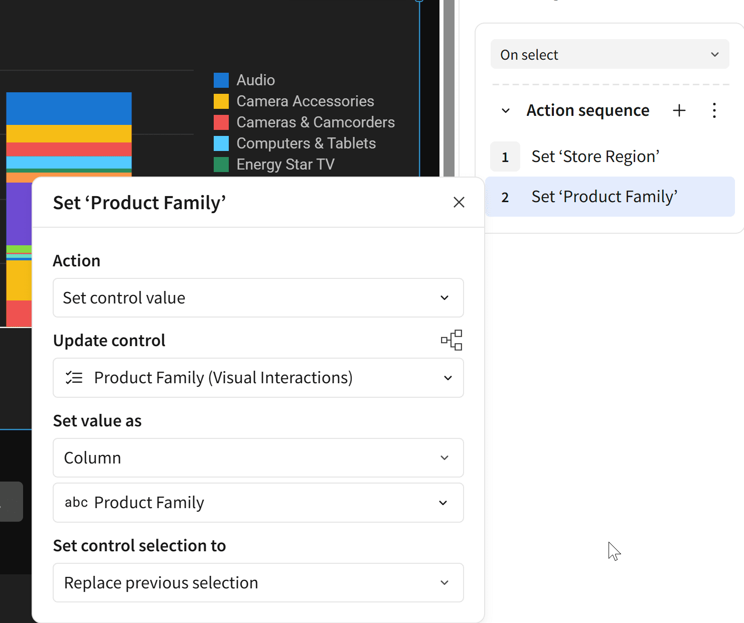
This way, each click on a bar segment sets controls, and the detail table updates instantly to reflect that selection.
Now, when you click on a stack in the bar chart — for example, one that represents:
Region = East
Product Family = Audio
Sigma will:
Trigger the action sequence
Set the Store Region control to
EastSet the Product Family control to
Audio
As a result, the detail table instantly filters to show only the records related to that combination, delivering a seamless, interactive experience between visuals.
NOTE: Sigma allows you to click multiple stacks in the same visual. Each new selection is added to the previous one, updating the controls accordingly.
For example: Clicking on East–Audio and then South-Hobbies&Creative Arts will result in the detail table showing rows for both combinations.
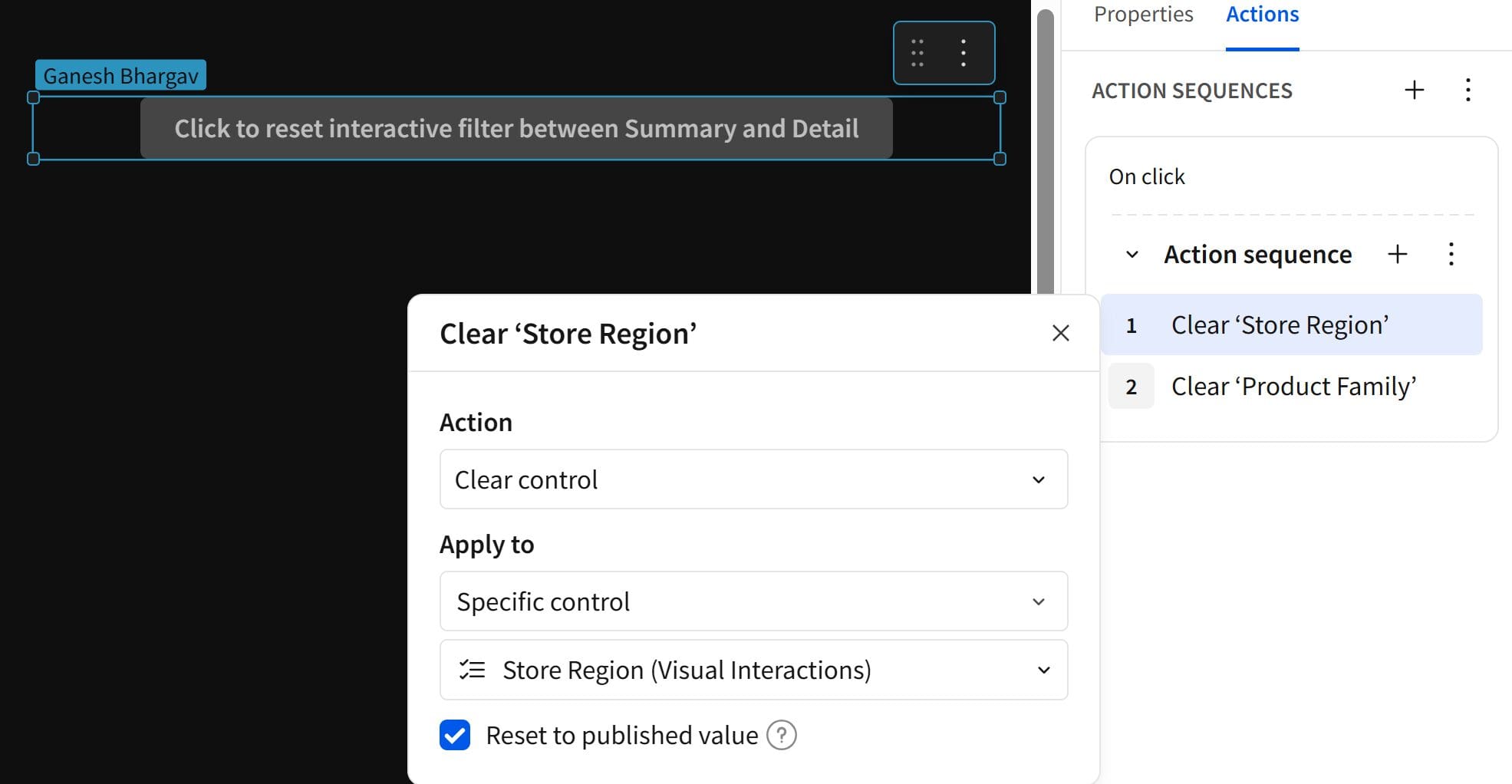
Step 4: Add a Reset Button to Clear Filters
Let’s add a Reset Button that clears the selections and returns the detail table to its unfiltered state.
From the UI Elements menu, add a Button to the canvas.
Give it a meaningful label, something like:
“Click to reset the interactive filter between Summary and Detail”.With the button selected, go to the Actions tab and create a new Action Sequence.
Inside the sequence:
Set the action type to Clear control.
In Apply to, choose Set Specific Control.
Select the control for Store Region.
Now, add another Clear control action sequence for
Product Family.Make sure to check: Reset to published value.
This ensures that any filters applied — whether through the bar chart, manual control changes, or default selections will all be reset when this button is clicked.
You now have a fully functional, interactive dashboard experience where:
A bar chart drives filtering in the detail table
A reset button clears everything back to the default state.
Generalizing Across Visuals
This interactive approach isn’t limited to bar charts alone — you can apply the same logic to other visual types like:
Line charts
Area charts
Pie charts
Pivot tables
Any visual that supports On select actions
The core setup remains the same:
Create controls for the fields involved
Set up sequences to update controls on visual selection
Target your detail visuals using those controls
Special Note for Pivot Tables
Pivot tables often involve:
Multiple aggregated metrics (e.g., Sales, Profit, Margin %)
Across different dimension hierarchies (e.g., Category → Subcategory → Item)
In such cases, you’ll need to configure a separate sequence for each metric or combination you want to make interactive.
That means: For every selectable metric in your pivot, you must set up its own
On Select → Set Control Value sequence to interact with your detailed visuals, such as the bar chart.
This ensures flexibility but requires precision, especially in complex dashboards with many levels of drill-down or metric comparisons.
Things to Keep in Mind
To ensure a seamless and scalable interaction setup, keep these key tips in mind while designing your dashboard:
1. Name Controls Clearly
Use intuitive names for your controls, like Region Filter, Product Type, etc. It helps during configuration and makes maintenance easier later.
2. Add Visual Cues for Interactivity
Let users know the visuals are interactive. To improve usability and engagement, use tooltips, button-like formatting, or labels such as “Click bars to filter”.
3. Use a Shared Data Source
Ensure your summary visual (e.g., bar chart) and detail table are built from the same data source or dataset. This avoids mismatches or filter breaks during interaction.
4. Hide Controls from End Users (If Needed)
If you don’t want the control elements (dropdowns, lists) visible to your users:
Place them on a separate hidden page in the workbook.
They’ll still function perfectly for the logic behind actions and filters, but won’t clutter your main report view.
Wrapping Up: Visuals That Talk
This technique gives your Sigma dashboards the kind of dynamic interactivity that users often expect from tools like Power BI and Tableau. The best part? It’s built natively, with no scripts or hacks, just Sigma.
While Sigma doesn’t offer built-in cross-filtering between visuals, it gives us something as powerful: Actions and Sequences. With some creative thinking, you can design dashboards where visuals aren’t just static displays, but interactive drivers that shape the user experience.
This kind of interactivity helps analysts and stakeholders explore data more naturally — clicking, filtering, and diving deeper without navigating across pages or relying on dropdowns.
As you build more advanced use cases, you’ll find that this approach isn’t limited to bar charts or tables — it’s a flexible pattern you can extend across any combination of visuals to build responsive, modern, and tailored dashboards.

Keep the momentum going by exploring more of our
Sigma Computing blogs:
FAQs
Do the summary and detail visuals need to use the same dataset?
Ideally, yes. Both visuals should use the same data source or model for clean interaction and accurate filtering. If you use different sources, ensure that field names and values are aligned.
Can I apply this method to visuals other than bar charts?
Yes! You can apply the same approach to any visual that supports the
On select action, like pie charts, line charts, area charts, and even pivot tables.
Can I set up interactions between multiple visuals (not just 1-to-1)?
Yes! You can reuse the same control across multiple visuals as long as those visuals are set as targets. Clicking one visual can update several charts, tables, or pivot tables simultaneously.
Can I combine this with other controls already on the dashboard?
Yes. This approach works well alongside manually selectable controls (like dropdown filters). Just be cautious about conflicting selections, and use the
Reset to published value option in your reset button to keep things clean.


