Welcome to the 5th of 5 posts (though I may have an encore) on improving parameter design in Tableau. So far we have discussed:
how parameter formatting hasn’t improved over time and gave one possible design solution and wrote a how-to on the topic.
the need for toggle buttons for boolean values and give an example.
the need for linked parameters–how parameters interact with each other and respond to each others values and build it with multiple sheets.
how to create a slider that you can format. This used external data but was linked via a parameter action.
In this post we discuss how we can use the same concepts of using a sheet and a parameter action to build a parameter user interface that we’ve never had before—a vertical slider.
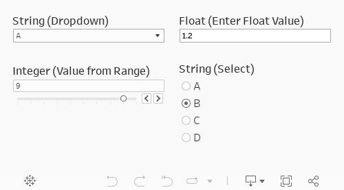
Once again, we’ve always been stuck with one of these four options. But there are many cases where I’ve personally wanted to have a vertical slider for my parameter. There has been no workarounds, just a horizontal or enter a value.
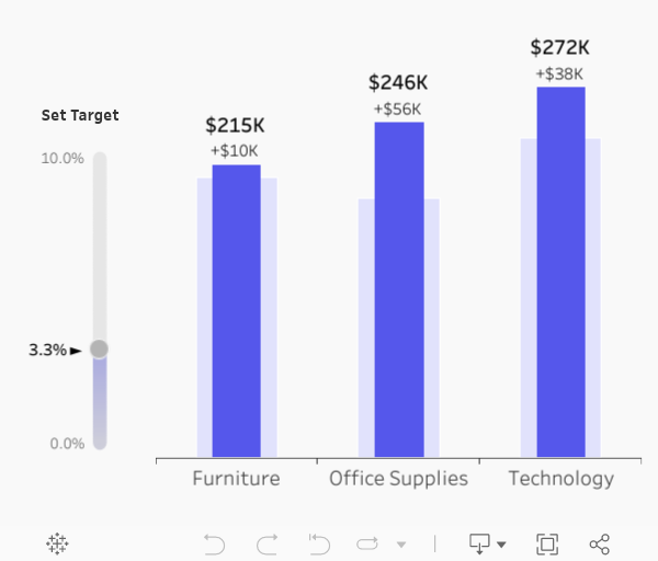
Using a sheet that looks like a slider and a parameter action we can build a “vertical slider”. Consider the bar-on-bar chart below: here we have actual sales in the darker shade and the target as a lighter tint in the background. I also have a vertical slider that allows me to increase or decrease the target. I can hover over the “slider” to see the potential value I want to select, and when I select a value I then update my target. If I increase the value high enough (9.3%, for example) then the values on the target change. I could have done this with a standard horizontal sliding parameter but since my numerical axis is vertical, I wanted to align the slider with it.
There are many more use cases we could consider. All of them are driven by the context of the visualization. By having a vertical “slider” we provide additional flexibility to parameters to fit the need of our end users.
That said: time for a tutorial on how I did this.
Step #1: Create a dataset from 0 to 100 by 1s. Copy into Tableau
First create the data set (I made it in Google Sheets). Create a single column called [value] that is valued from 0 to 100 by 1s. I’m actually just recycling an existing data set I’ve already created. I could easily have done this from 0 to 0.1 by .001 if I really wanted. It’s all driven by your need. These will ultimately be the steps in the parameter so you should set these values based on your need. Also: feel free to make the list of numerical values longer than you want. You can always filter them on the visualization to meet the limits you are looking for. Given that this is an external data set you probably want to cover off a range that is larger than your use case.
Copy-and-paste these values into Tableau.
Step #2: Place a continuous dimension on rows.
First we are going to build a calculation that is just [value]/1000. This is going to change my values to range from 0-100 to 0%-10%. It’ll allow me to also change my values by a step of 0.1% instead of 1.
Step #3: Create your float parameter.
Create the parameter. Pick any value between your starting and ending range on your sheet from Step #2. You won’t have to worry about the values too much because it’ll eventually be driven by a parameter action.
Add the parameter to columns. Set the mark type to circle and create a synchronized dual axis.
Step #4: (Optional) Create a gradient color calculation. Add it to color on the [Value] marks card. Set the color.
Set the custom gradient colors. For the low value set the color to #F3F3F3 and the high value to #40A4D5. Set the low value to -200 and the high value to 100. Set the center to -10 and use the full color range.
This leaves us with the following sheet.
Step #5: Format the sheet. Add MIN(0.0) to columns. Set the axis to -1 and .3.
Remove all lines and dividers. Hide the header.
Step #6: Add labels.
Create a the following calculation. Set the default formatting to a percentage with no decimals. For the line label the end points. for the switch label the value and add a right arrow (►).
// Parameter as percent [switch]/100
Step #7: Build your visualizations that use the parameter. Create the dashboard.
Place the two sheets side-by-side in a horizontal container. This way you can have the text next to the slider.
Step #8: On the dashboard add a parameter action on the slider.
Select the slider sheet name (color in this example). Run the action on select. Set the target parameter to [switch] and select the value of [color] with no aggregation.
Step #9: Add a filter to automatically deselect the slider after a click.
This is one of my favorite techniques for automatically deselecting text. You can read about it in detail here.
First create two calculated fields. One called [TRUE] with the value of TRUE and the other calculation of [FALSE] with a value of FALSE. Add these calculations to detail the slider visualization.
Add a filter action. Select the color sheet on the dashboard. Run the action on select. Set the target dashboard to the color sheet–not the dashboard. Show all values when clearing the selection. Target filters will be [TRUE] for source and [FALSE] for target.
Final Result
Takeaways
Vertical sliding parameters are a must for a modern user interface in Tableau. This functionality is not available out-of-box in Tableau but you can create the functionality using a sheet and a parameter action.
Across this series we highlighted the need for improvement on parameter user interface, particularly when it comes to both design and accessibility. By using sheets with parameter actions we can bring fresh life to parameters.
While this was supposed to be the the 5th of five posts on the topic, there will be one more to discuss multi-select parameters (which we think might be a feature in 2020 based on our knowledge in the Tableau Forums).