

Here are a few tips from our Tableau team for creating unique and interesting dashboards for your end users.
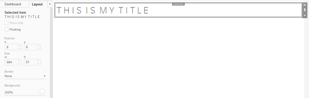
T i t l e s N e e d W h i t e s p a c e T o o
The concept of white space is usually applied only to charts and other elements of your dashboard, but rarely do we think of giving text white space as well. A way to do this is to put spaces in between your text characters in your titles.

Putting white space in other areas of your dashboards, including filters and sub-headers, can help as well. In order to get white space in your field names use the formula below. Use this field to filter and the drop down values will have the extra space in them like the title above.
REGEXP_REPLACE(REPLACE(UPPER(TRIM([Field name])), " ", " "), "(.)(?!$)", "$1 ")
Divider Bars Using Padding
Tableau veterans remember when the best way to do a divider bar was to create a blank floating text box and format the back ground then manually set it in place on the dashboard. Fortunately, Tableau has provided a much better of completing this same task.
First, place a horizontal container on your dashboard. Next, place the object that you want the divider to be under in the container by hovering over the specified container. Now you have two objects that you can set the background color on, which is how we will arrive at our divider line.

Click the dashboard object’s bar once to control that object, now click it again to control its container. Go to layout on the left side of the page and format the background to your choice of divider line color. This should put what look like a thick frame around your dashboard object. This happens because your default padding for an object is 4px.
Click on your dashboard object and set all padding to 0, then unclick the ‘make all padding the same’ to make the outer padding 2. For all intents and purposes your dashboard object’s background color is blocking all of the container’s background color except for 2 px at the bottom.

To adjust for how close you want your text to the line you can click format text then select where in the container you want the text to align. For further control, use the inner padding to make the text align where you want it to.
Parameter Hierachy Using Unicode
When using more than a few values in your parameters it can be helpful to provide some structure to your options. Using unicode text we can use the shapes below to create a hierarchy structure that makes choosing your value a little easier.


When entering your ‘Display As’ values in your Parameter use these shapes to make a drop down shape. This allows you to show users how the parameter values either roll up to one another or how they are structured.


Small Multiples with Parameters
Small multiple charts are extremely helpful when trying to see trending and patterns within a certain dimension. You can always create a chart and filter it, but it does not give you the same ability to compare in one view. Credit to Ryan Sleeper for the formulas.
					x-axis: (index()-1)%(int(SQRT(size())))

y-axis: int((Index()-1)/ (int(sqrt(size()))))

Place your x-axis field to columns and your y-axis field to rows. Make both of these fields discrete. Then take whatever dimension you want to see in the small multiple format and drag it to the marks card. Change the way the x and y-axis are calculating to point to the field you just placed in the marks card.
To provide even more flexibility for users, you can use a parameter to enable users to select the level at which a user gets to view the small multiples. If you have sales data for State, Region, and City, create a parameter that outputs the geographical field of choice. Create a string field that outputs your desired Parameter field then place in the marks card. Have your x and y axis calculate using this field and that way your table will re-calculate itself based upon the value in the field you’ve selected.


