

This post is the second in a series examining a whole host of game-changing Tableau Desktop features that have been released in 2020. In the last edition of this series, we covered Dynamic Parameters.
In this post, we will be diving into Viz Animations which were also released in Tableau Desktop 2020.1. Although this feature is mostly aesthetic, Viz Animations can enable additional insights, add a cool flavor to your dashboards, and allow Tableau developers to have the same functionality found in other similar visualization software. Let’s check out this cool feature!
What are Viz Animations?
Viz Animations allow users to see the transition of your data from Point A to Point B when it’s being filtered, sorted, or otherwise interacted with. Previously in Tableau, when you performed some sort of action of your data, the result was instantaneous (or at least done as soon as load had completed). With Viz Animations, you are able to slow down that transition and specify how slow you want it to go.
This transition can either be used to help users see how the chart element they’re looking at changed, or it can simply be for visual effect. There are a lot of famous data visualizations that use movement to emphasize a point. The Washington Post released an animation showing the theoretical spread of COVID-19 in March 2020 that went viral. The movement of the elements within the visual wasn’t necessarily required, but it certainly helped display the data in a manner that enabled more insight and interest.
How to Use Viz Animations
The developers at Tableau made using animations fairly straight forward. Let’s jump right into how to add this feature to your dashboard.
Navigate to your very top toolbar and locate the Format drop down (image below, left). About half way down this list of options you’ll find Animations. Click that option. Next, you will see that the Workbook Default is set to Off (image below, right). In order to enable our desired animations for every worksheet on the dashboard, select On. You can also first click a specific worksheet on your dashboard and then the Selected Sheet area at the bottom will populate with options.


After enabling animations for either the workbook or the selected sheet, you will then have to populate the Duration and the Style options.
The Duration will determine how quickly the change in the data is animated. The longer the Duration, the more slowly that transformation takes place. If you have a short Duration, the animation will be very quick. You can choose from one of the four default options, or you can enter a Custom value in integer form.
The Style determines in what order the animations take place. The two options are Sequential or Simultaneous. If you choose Sequential, then any transformations that are already on your page will happen first, followed by any data that is being brought from outside of your existing page. If you choose Simultaneous, the transformation of your chosen chart elements will all happen at once.
It is important to remember that if you turn animations on before developing your workbook, every time you edit your workbook, animations will be applied even in the worksheet views. This can not only be annoying, but it can slow down your development speed as well. So make sure if you want to apply Viz Animations, do it when you’re near completed with the dashboard.
Animation Example
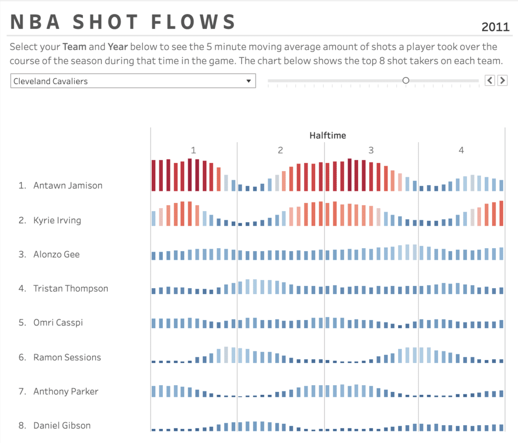
Now that you understand how to apply Viz Animations to your dashboards, let’s take a look at a few examples. In the example below I have created a bar chart that shows the moving average of shots taken during specific minutes and quarters within all basketball games during that season. You can cycle through different teams and years using the filters near the top of the dashboard.
This dashboard is set to 0.3 second Duration and Simultaneous Style. You can see how quickly the animations happen, and all at the same time.
In this example, I’ve selected the Duration as 1 second and Style Sequential. The Sequential rendering has the data that will not be in the next view exit, then the remaining data moves and reorganizes itself, then the data that will be present in the new view enters. The longer duration time is also making the transition from one view to another take longer.
For the NBA Shot Flows dashboard we’ve been looking at, I believe that using a Simultaneous Style and Duration of 0.5 seconds will be appropriate. I have published the dashboard with these animation settings to Tableau Public, which now supports animations, so feel free to explore and check out the dashboard below!
When to Use Animations
As you can see, Viz Animations are pretty sweet! Although not meant for use in every scenario, Viz Animations are useful useful in a number of scenarios:
- Showing change in position after a change in a contributing variable
- Telling a story with your data that involves time
- Enhancing a dashboard for specific users that enjoy engaging visual features
Even though animations can help enhance your dashboard, there are also scenarios when they should not be used. Those include:
- Using them just because they exist
- To make stuff "look cool" even when users don't care
You also need to exercise constraint on their use because they may not always be applicable to your use case. Just like the old parental refrain, just because you can doesn’t always mean you should. All in all, Viz Animations are a great new feature to Tableau Desktop, and when used in the right situation, can take your dashboard to the next level!
Need more help making your Tableau dashboards a work of art? Our knowledgeable team of Tableau experts is here to help!


