This Procurement Spend Analytics Tableau Dashboard provides business users an overview of their spend volume by vendor and by category. Users can quickly view who their top vendors and spend categories are, across spend volume, spend per vendor, active vendors, and new vendors.
This dashboard also provides a performance overview, comparing current and previous spend metrics.
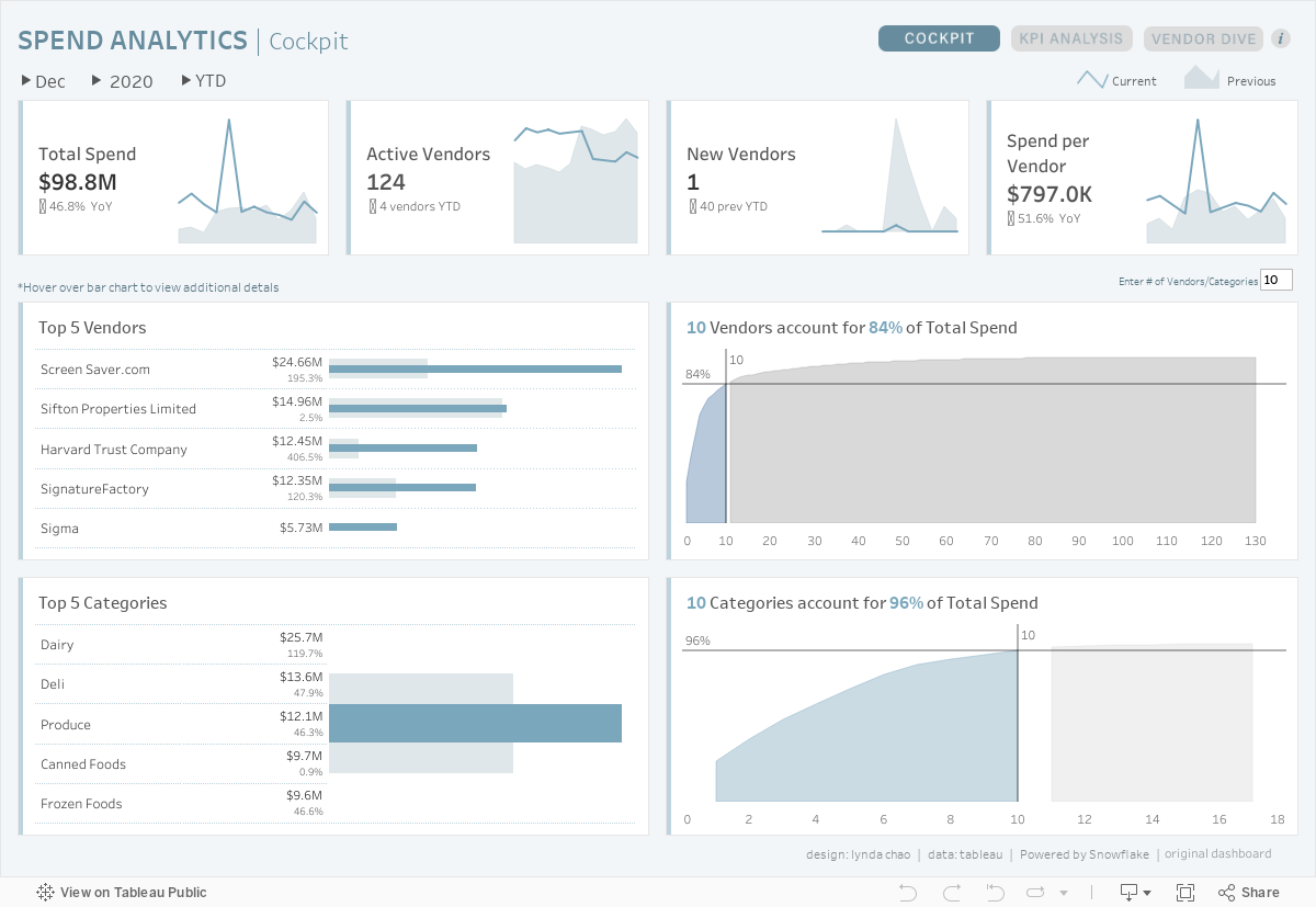
Example
Who Is This Dashboard For?
This dashboard is designed for procurement managers and specialists who are looking to uncover which spend categories drive the most purchasing value, and which vendors they are spending the most money at.
This dashboard will ultimately help procurement understand who are their top vendors, top categories, and drive business decisions around where and how their dollars are spent.
What Can Be Accomplish With This Dashboard
Cockpit
For dashboards, a cockpit refers to the main page that summarizes measures and metrics that are relevant to the business unit or responsibility area of a manager. This tab provides a high-level overview of all four indicators: total spend, active vendors, new vendors, and spend per vendor.
Users can also view who the top 5 vendors and categories are, as well as a pareto chart that describes how many vendors or categories account for a majority of total spend.
Selection Buttons:Use the buttons (▶) at the top left of the dashboard, just under the title to select which month, year, and time period (MTD, QTD, or YTD) to display the data. This adjusts the values in all KPI cards, tables, and charts on the dashboard, except for the monthly trend line/area chart in the KPI cards.
Dynamic Tooltips: Hover over a bar chart in the vendor bar chart, to view spend categories that are attributed to the spend for the vendor in the tooltip. The same can be done for the categories bar chart, which will display relevant vendors in the tooltip as well.
Dynamic Pareto Chart: Enter the number of vendors or categories for the pareto charts.
Navigation Toggle:Click on the buttons in the top right of the dashboard to navigate to the other dashboards.
Selection Buttons:Use the buttons (▶) at the top left of the dashboard, just under the title to select which month, year, and indicator type to display the data. This affects all charts on the dashboard.
Filter Button: Click on the filter button in the top right corner of the dashboard to select additional filters for the dashboard, related to categories and vendors.
Time Period Parameters:Select which time period (MTD, QTD, or YTD) to display the data in the Vendor and Category table.
Navigation Toggle:Click on the buttons in the top right of the dashboard to navigate to the other dashboards.
Vendor Dive
The final tab offers users the ability to select a specific vendor and observe monthly trends and spend categories for that specific vendor.
Selection Buttons:Use the buttons (▶) at the top left of the dashboard, just under the title to select which month and year to display the data. Click on the button (▶) just before the vendor name, to select the vendor to display. These selections affect all charts on the dashboard.
Filter Button: Click on the filter button in the top right corner of the dashboard to select additional filters for the dashboard, related to categories.
Time Period Parameters: Select which time period (MTD, QTD, or YTD) to display the data in the Spend Categories chart.
Navigation Toggle:Click on the buttons in the top right of the dashboard to navigate to the other dashboards.
Conclusion
We hope you found this dashboard useful in your pursuit to identify top vendors and spend categories in your organization! If you have any questions, need help, or are interested in having a team of Tableau experts design dashboards for you, feel free to reach out!