I like big bar charts…and I can not lie.
Thank you to all three of you who laughed at my corny joke. But for real, I think bar charts are great: They are 1) simple to make and 2) simple to understand. I’ve also been playing around with small multiples a lot lately. They are also great because they provide the end-user a high-level overview making it easier to spot trends and outliers.
Here are some awesome Small Multiple examples to check out: Spencer Baucke & Luke Stanke’s Oscars Still So White and Jacob Olsufka’s Presidential Election Results
So, inspired by Luke’s Trellis Chart blog, John’s Small Multiples blog, and my love of bar charts I thought, “What if we combine the two?”
Step #1: Created a Fixed Calculation for Your Ranking Metric
					//Sales | Fixed Name & Sub-Category

{ FIXED [Customer Name],[Sub-Category]:SUM([Sales])}
Step 1 Demonstration:
This calculation says “give me the sum of sales for each combination of Customer Name & Sub-Category regardless of what else is on the viz”.
Fixed calculations are a way to change or lock the level of aggregation even if a different level of detail is added to the viz. For example (below), if we use { FIXED MONTH([Order Date]):SUM([Sales])} and split it out by Month, then split it out by day, the monthly total will repeat itself for each day because we have locked the aggregation to month.
Step #2: Create Column Calculation
Create a new calculation to find the number of columns needed. This calculation allows for your column number to dynamically change if filters are applied. How does this (and the row calculation) work? That’s a topic for a different day and a different blog. But the short version is Math Magic.
If you are limited on dashboard width (as I am for this blog format) I would recommend using static column and row numbers. The dynamic column and row formulas are based on the number of items (Sub-Category) not the pixel size available. For static columns and rows using the formulas from here: Luke’s Trellis Chart blog.
					//Column
(index()-1)%(int(SQRT(size())))
Step 2 Demonstration:
Step #3: Create Row Calculation
This is a similar calculation to identify the number of rows that should be used.
					//Row
int((Index()-1)/ (int(sqrt(size()))))
Step 3 Demonstration:
Step #4: Create Rankings
Add a new calculation to identify the rank of each customer and sub-category combination. I chose rank_unique because in testing rank and rank_dense would place two bars on the same row if the values were the same. I opted to separate these values into different rows, but the rest of the steps will theoretically work if you prefer to have duplicate values on the same row.
					//Rank
RANK_UNIQUE(ATTR([Sales | Fixed Name & Sub-Category]))
Step 4 Demonstration:
Step #5: Top N Options
If you would like your users to be able to change the number of top rows shown, then you’ll need to create a parameter. If this step doesn’t apply to you, hardcode the number in the filter step.

Step 5 Demonstration:
Step #6: Rank Filter
Create a new calculation to limit the number of rows shown.
					//Rank Filter
[Rank]<=[Top N]
Step 6 Demonstration:
Step #7: Build the Viz
First, we’ll bring out all the formulas we need, then we’ll go back and edit them accordingly. So don’t be concerned if things don’t look correct right away.
- [Column] on Columns
- [Row] on Rows
- [Customer Name] on Detail
- [Sub-Category] on Detail
- [Rank] on Row
- [Rank Filter] on Filters (Select True)
- [Sales] on Columns
Step 7 Demonstration:
Step #8: Edit Fields
Next, we need to edit the table calculations for several fields.
To put these steps in words: We want the columns and rows to be based on/count the number of Sub-Categories. As opposed to the ranking calculations which should be based on each Customer Name within each Sub-Category.
[Columns]
- Convert to Discrete
- Edit Table Calculation to be Specific Dimensions
- Check Customer Name & Sub-Category
- Drag Sub-Category above Customer Name
- At the Level: Sub-Category
[Rows]
- Convert to Discrete
- Edit Table Calculation to be Specific Dimensions
- Check Customer Name & Sub-Category
- Drag Sub-Category above Customer Name
- At the Level: Sub-Category
[Rank]
- Convert to Discrete
- Edit Table Calculation to be Specific Dimensions
- Check Customer Name & Sub-Category
- Drag Sub-Category above Customer Name
- At the Level: Customer Name
- Restarting Every: Sub-Category
[Rank Filter]
- Edit Table Calculation to be Specific Dimensions
- Check Customer Name & Sub-Category
- Drag Sub-Category above Customer Name
- At the Level: Customer Name
- Restarting Every: Sub- Category
- Edit Filter: Select True
Now, your viz has taken shape and should be correct. If something looks wrong, go back and double-check the Fixed Measure calculation and the table calcs. Make sure you have the same dimensions in the fixed calculation as on the details in your viz.
Step 8 Demonstration:
Step #9: Add Filters to Context
Let’s say you wanted to be able to filter these rankings based on Region. In the Superstore data, a customer can appear in multiple Regions.
First, add the [Region] to Filters. Then right-click on it and select “Add to Context”. This turns the pill gray and moves it above the [Rank Filter] pill.
What does Adding to Context do exactly? It forces Tableau to change the filter’s place in the order of operations. Before, in our Fixed calculation we said “Tableau, ignore anything that’s not Customer Name and Sub-Category.” Adding to context stays “Tableau, please care about Region and filter that before calculating the Customer Name and Sub-Category calculation.” For more information about Adding to Context and Tableau’s Order of Operations, check out this blog from Ken Flerlage: Tableau Order of Operations
Step 9 Demonstration:
Step #10: Format
The last few pieces are formatting your viz. So feel free to change it up!
The main thing I’ll show is adding the side Sub-Category labels. I will say that typically you want to avoid rotated text labels, it can be difficult to read up to down vs left to right. So if you know of any tips or tricks for how to use these steps but add a horizontal label, please hit me up on Twitter: @data_katrina!
1. Add Min(-1.0) to columns in between [Column] and [Sales]
2. Right Click on [Sales] and select Dual Axis
3. Edit Axis for [Min(-1.0)
- Fixed Start -1
- Fixed End 10
4. Convert back to bar (if Tableau changes the marks type)
5. Hide the axes and row and column headers
6. Change view to Entire View
- You can change this later, but it’ll make identifying the Sub-Category labels easier if there’s more space
7. Replace Color with [Sub-Category]
8. Add [Sales] and [Customer Name] to Sales Bar Label and format
- (In the video I use ctrl+click to add [Sales] from columns.)
9. Create a new calculation called [Sub-Category Label]. This formula is used to label only the middle rank.
					//Sub-Category Label
if round(WINDOW_MEDIAN(if [Rank Filter] then [Rank]
END,FIRST(),LAST()),0)=[Rank] then attr([Sub-Category]) END
10. Add [Sub-Category Label] to the min(-1.0) Label
11. Edit the [Sub-Category Label] table calc
- Make sure both calcs are set to:
- Check Customer Name and Sub-Category
- Drag Sub-Category above Customer Name
- At the Level: Customer Name
- Restarting Every: Sub- Category
A Nested Calculation is a calculation inside another calculation. We need to tell Tableau how each calculation should act. In our example, we need each calculation to find the customer rank within each Sub-Category.
12. Edit the Min(-1.0) Label alignment direction to be up, horizontal alignment to be centered, and check to Allow Labels to Overlap other marks
13. Change the Min(-1.0) bar size to be as large as possible
14. Turn off Tool Tips
15. Remove gridlines and zero lines
16. Change Row and Column dividers to large white lines
17. Add Row Banding
18.Add a Zero Line for each Sub-Category
- Add a Custom Reference line
- Add to each Cell on Min(-1.0)
- Set Value to Create Parameter
- Create a new parameter with a value of 0
- Set Label and Tooltip to None
- Change color and size of line
19. Add it to a Dashboard and start playing around with the row sizing and number of rows
20. Hide headers
Step 10 Demonstration:
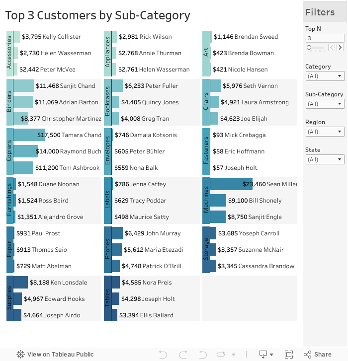
And there you have it: A dynamic small multiple ranked bar chart. Here is a link to the workbook: Ranked Small Multiple Bar Chart Tableau Public
I hope this blog can help you love bar charts, big and small. Do you have more questions about Tableau? Talk to our expert consultants today and have all your questions answered!


