
The Service Desk Monitoring Dashboard example gives the end user a summary of the service desk’s performance, featuring the flexibility to view them at multiple time intervals and dimension groupings.
This Tableau dashboard example also provides insight into how to optimize resource allocation and improve service desk efficiency.
This dashboard is meant for executives and managers who oversee the service desk activities and want to see a high-level summary of service performance gaps and trends, specifically to identify opportunities to improve service.
This dashboard allows the user to see agent groups that are underperforming and monitor performance from period to period.
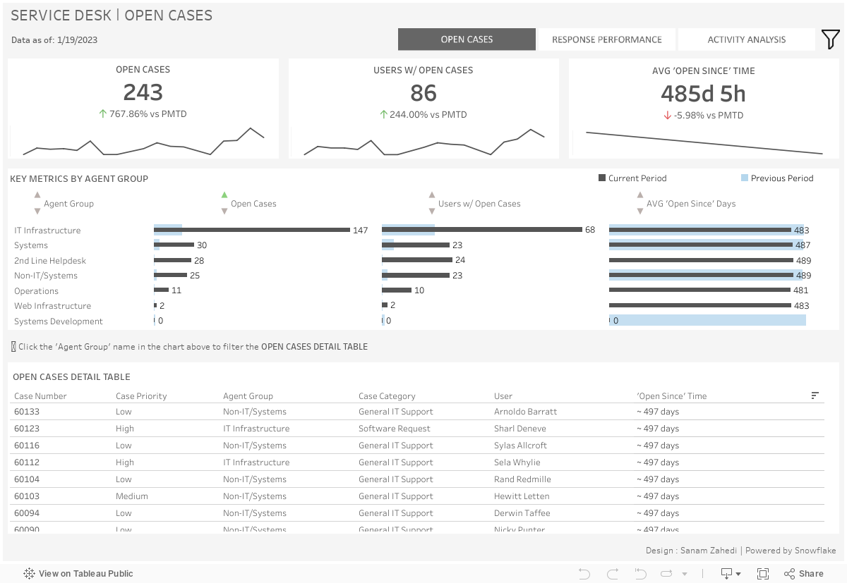
KPIs: Each card contains a KPI related to the open cases during the specified period, number of open cases, number of users with open cases, and the average ‘open since’ time for the population of cases. The trendline represents the movement of the given KPI over the specified time period to the selected end date.
Key Metrics by Agent Group: Each group of bars represents KPI metric, broken out by Agent Group, to show groups with the most/least outstanding cases and top/bottom ‘open since’
Times. The ‘Key Metrics by Agent Group’ chart can be used to filter this table to only view cases related to the selected Agent Group.
Open Cases Detail Table: This table contains relevant details about the open cases during the specified time period.
KPIs: The KPI cards each contain KPIs related to resolved/closed service desk cases during the specified period. The trendline represents the movement of the given KPI over the specified time period to the selected end date.
Agents Group and Priority – Closed Cases and Ratio: This chart shows the number of closed cases and the ratio of closed to created cases by Agent Group and priority level. The color saturation is based on the closed-to-created ratio; darker cells have a higher proportion of closed cases to created cases.
Agent Group – Avg. Resolution Time: This chart shows the average resolution time for the closed case population, broken out by each Agent Group.
Agent – Response Performance: This table displays the closed cases, users served, and average resolution time for each individual agent. The two charts above the table can be used to filter to only agents in the selected Agent Group.
Case Creation Distribution: This chart shows peak case creation periods throughout the work week. This allows visibility into the busy and idle periods to inform resource allocation.
Case Assignments – Top Agents: In this chart, agents are ranked by the total number of created cases assigned to them in the selected time period. The tooltip for each agent also shows the percentage of closed to created.
Case Creation – Top Users: In this chart, users are ranked by the number of cases they have created in the selected time period.
Closed/Created Case Trending: This chart shows side-by-side trending for created cases and closed cases. The dark grey trend line represents the closed cases, and the light grey trend line represents the created cases.
We hope you found this dashboard to be a useful template for monitoring overall service desk performance, quickly identifying service desk groups that are performing below expectation, and guiding resource allocation strategy.
If you have any questions or are interested in having a team of Tableau experts design dashboards for you, feel free to reach out!