

This blog will show you how to use containers to create pop-out side bars in your Tableau dashboards. Side bars allow you to display extra information or context around a data point, but by having them pop out you also preserve some of your precious dashboard real estate. When trying to convey details about multiple levels of granularity, pop-out side bars can be quite helpful. Let’s walk through how to create a pop-out side bar using a simple example that we’ve covered in a previous blog.
Step #1: See Before We Build
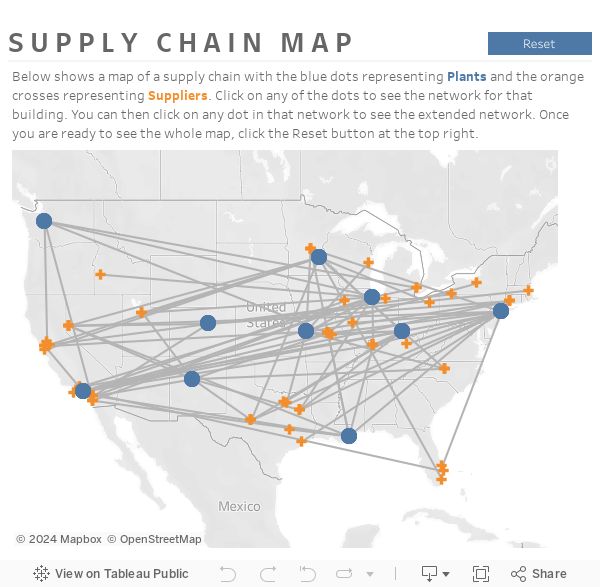
Please find the example dashboard below showing a supply chain network of Plants and Suppliers for a fictional company. When you click on a Plant or Supplier on the map, its corresponding network is shown. Additionally, a side bar pops out on the right-hand side that gives you more details for that point.
You can also view the dashboard here in Tableau Public.
Using a pop-out container allows you to interact with a map on a dashboard in a whole new way. You can drill in and see additional context when desired. This means when you don’t want to see the additional context, you can have more real estate to view the map.
Now that you’ve seen the functionality, let’s build this thing!
Step #2: Starting the Build
First, we need to determine what we want to show in our side bar. In this example, the information relevant to a side bar is information about the items you are clicking on within the map. Because you can only click one Plant or Supplier at a time, we will make the side bar show us details about 1) the place we selected with our click 2) the other locations associated with the primary location network.
This means that we will build out two different worksheets in our pane: one showing details about the primary location and another worksheet showing details about the primary location’s associated network. Let’s start out by positioning everything else where it should go on the dashboard. See below for the general layout of the dashboard.

As you can see above, the sidebar will be located on the right-hand side of our big horizontal container, so you can place a blank place holder object there for now if that helps you get your dashboard organized.
Step #3: Build the Calculation
Next, let’s create a worksheet to show details about our primary location (the location you click on). Start by creating a Parameter. This parameter will be blank initially, so for some inexplicable reason I am going to name it [Blank Parameter]. Although this parameter is blank to begin with, our map clicks will eventually populate it.

Next, let’s create a calculated field that will show details about our primary location (the location you click on). We will call this our Show field. The field should return a T|F based upon whether the value in our [Blank Parameter] field matches the value in our [Plant/Supplier ID] field.
					Show :
[Blank Parameter]=STR([Plant/Supplier ID])
END
Drag this field to the filter pane in a new worksheet and select TRUE. This will keep only the values that match the Blank Parameter field that is populated upon your click. And keep in mind, when the parameter field is empty, it will not match any of the Plant or Supplier ID’s.
Next, drag on the dimensions and measures that you want to display about this primary location. Here, I wanted to see the Plant or Supplier name & ID, its type, and the volume of theoretical sales associated with each location. See the values below.

As you can see, I’ve also included a “” value in the Columns as an in-line calculation. This is a little Tableau hack that allows this worksheet to collapse.
Drag this new worksheet to the top of the vertical container to the right of your dashboard.
Step #4: Complete Side Bar
Now that we’ve built the first part of our side bar, let’s finish the rest of it. The part we’re missing is the information about all the locations associated with the primary location’s network.
We still want to see data associated with the primary location, so we still want the [Show] field in the filter pane and set to TRUE.
To get the associated locations to show we will create a set with the Plant/Supplier ID. The formula for this field is shown below.
					Plant/Supplier ID:
IF [Type]="P" THEN [Plant Id] ELSE [Supplier Id] END
Drag this field to your filter pane and right-click on the pill. Select Show Members in Set. This will keep everything that is within this set. Now we need to create a field that will show the associated locations. We will call this the Location field.
					Location:
IF [Type]="S" THEN [Plant Name] ELSE [Supplier Name] END
Drag this field to the rows shelf. Also include the “” in-line calculation in the columns shelf and any other measures you might want to see about your associated locations. See the worksheet set up below.

Drag this second worksheet to the bottom position in your vertical container on the right-hand side of the dashboard. Now when you click on an item in your map, these two worksheets will pop out and give you details about the location you selected. When you reset the dashboard, those details will disappear!
Thanks so much for reading! Hopefully you find this technique and/or concept useful. Do you have more questions about Tableau? Talk to our expert consultants today and have all your questions answered!


