

Tableau offers its users a vast array of geospatial tools for mapping and other geospatial analysis including buffer calcs, distance calculations, and the ability to drill down into different levels of geospatial granularity with a click of the button. These capabilities are often a reason that we find clients using Tableau as their primary Supply Chain visualization and analysis tool. In this example, I am going to show you how to create a map showing the current locations of the material shipments like in the map below.

Step 1: Plot Our Map
First, let’s understand the structure of our data before we plot our points and write our calculations. In the snapshot below, you can see that the data is structured as each row representing one day’s worth of information about each boat that is carrying our materials. One thing to note is that not all the boats have information entered on the same dates. This will come into play when creating our date calculations.

Now it’s time to plot our points to discover how our location data shows up on the map. Start off by double-clicking the [latitude] field and then the [longitude] field. You’ll notice that they automatically go to the appropriate Column/Row placement. Now, drag the [Date] field to the Marks card to show us all of the specific points in the data. Next, place the [Ship ID] field onto Color. This will leave you with a dot for all of the specific locations in our data. To show our routes, change the Marks type to Line. You should have what is shown in the image below.

Step 2: Create Calculations
Although the map we have now is cool, it doesn’t necessarily show me where the ships are currently, or at least where they were at their last known location. In order to map where the ships are currently, let’s start by creating a calculation to get our most recent date. This is also a calculation that is extremely useful for reports that have data refreshing daily.
					//Max Date
{MAX([Date])}=[Date]
Using the curly braces will give you the max of all your data that is within your filter context. Comparing this value at the row level to every [Date] value results in a T|F in Tableau that is not only efficient to calculate but easy to implement. By dragging this field to the filter pane and selecting TRUE you’ve just filtered for all data that has a[Date] matching the Max(Date) in your dataset.
Ah, but this calculation will not work for us! Why? Because we do not have uniform date information for each boat. If we were to filter on this, we would only be getting the boats that have data on the Max(Date) for the whole data set, not the latest data for each boat, so we have to change our calculation a little bit to adapt.
					//Max Date by Boat
{ FIXED [Ship Id]:MAX([Date])}=[Date]
Now that we’ve got our calculations ready, let’s get to building out our map.
Step 3: Build Out Visual
First, let’s duplicate the [Latitude] field by holding CTRL on your keyboard, clicking [Latitude], and then dragging to the right to duplicate it. Right click on the newly created field and create a dual axis. Change the type of the new marks to Circles so that you can see the lines with the dots over top of it. See the chart below.

Now, drag our Max Date by Ship calculation to the Marks card and place it on Color. This will require removing Ship Name from the Color but keeping it in Details. You should see the most recent dot for each ship in a different color than the rest of the dots. Go to the legend that has now appeared on your dashboard, right click on FALSE and select HIDE. You will see all of the dots that are not the max date, disappear.
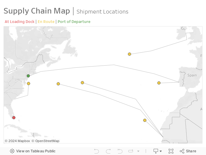
To complete the visual I have shown below, place the status of the ship on the color, but keep the Max Date by Ship field in Details to keep the unwanted points hidden. Now you have a map of all your ships with the most recent dates showing!
I do want to highlight that Tableau will not allow you to create a calculation with the latitude and longitude fields to replicate this. As an example, if you try to create a calculation that says:
					//Max Date Latitude
IF ({ FIXED [Ship Id]:MAX([Date])}=[Date]) THEN [Latitude] END
You will not be able to create a dual axis map with this field. When you drag it to Rows your map will change to a plot and you won’t be able to accomplish what we’ve done below.
Need more help making your Tableau dashboards a work of art? Our knowledgeable team of Tableau experts is here to help!


