

In this post we will discuss how to use Parameter Actions to navigate around a theoretical supply chain on Tableau map.
Requirements: We want to be able to click on either a supplier or a plant on a map and be able to then see what other plants/suppliers that location is associate with.
Data: Our data set consists of a plant id, supplier id, and a latitude and longitude. However, the data did not start off like this so I will show you the Tableau Prep workflow we use to structure our data appropriately.

Workflow: The initial data set is an excel sheet with three separate tabs, one with plant information, another with supplier information, and the last one with the routes going from suppliers to plants. Although my data is in Excel, think of this as three separate tables within your database for all practical purposes.
Although the Makeline() function is available in Tableau, I want to make straight lines from my origin to destination instead of arched lines.
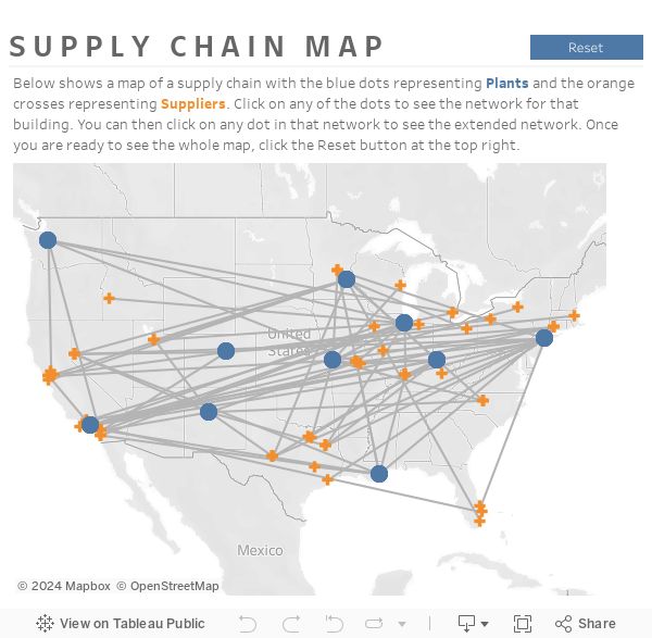
You can also view the report here in Tableau Public.
Structure Your Data in Tableau Prep
Because the data is not yet in the structure we need to create our map, there is some work that we have to do in Tableau Prep before we get to Tableau Desktop.
Step #1: Create Duplicate Data

First, I bring in the Routes table twice, because in my data model one of these tables will be the origin of my line and the other will be the destination. Create a calculated field in each data set, one that equals “S” and the other equal to “P”. This identifies each data set as each the Plant or the Supplier end of the line.

Since each data source has a latitude and longitude field, rename the lat/long fields in each data set plant_latitude and supplier_latitude so that you will know which data set each is coming from when we union the two data sets together in our next step.

Step #2: Union & Join Data
Drag one of the data sets you’ve created and hover it over the other in Tableau Prep. A few options will pop up, but we want to choose the Union function. This will stack the two data sets on top of one another and enable us to draw the lines from a plant to a supplier.
Next, we want to bring in the data that gives us details about each of the Plants and Suppliers. Bring on the tab in the Excel that is the plant tab and join that on plant_id. Do the same for suppliers and join on supplier_id. This should leave us with a data set that has a row for each Plant/Supplier, the routes that exist between each Plant Supplier, and details about each Plant/Supplier.
Step #3: Clean Data
Next, we need to simplify each line to have only one latitude/longitude value. Create a calculated field in Tableau Prep that uses the plant_lat/long if the the line is a Plant and the supplier_lat/long if the line is Supplier.
					IF [Type]="P" THEN plant_latitude
ELSEIF [Type]="S" THEN supplier_latitude
END
					IF [Type]="P" THEN plant_longitude
ELSEIF [Type]="S" THEN supplier_longitude
END
Build Your Map in Tableau Desktop
Now that we have our data set in the structure that we want it, we can now start to build out the visualization itself. See below for step by step instructions on how to create an interactive map using parameter actions.
Step #1: Create Blank Parameter & Filter
Since our map will be controlled by a parameter action, we first create a blank parameter. The reason we have a blank parameter is that we want to be able to populate the values of the parameter from values on our map.

Next, create a calculated field named [Parameter Filter] that will serve as our worksheet filter. The filter essentially says, if there is nothing in the parameter, then TRUE. If we click on a plant_id, then that value is in the parameter, return TRUE. If we click on a vendor_id then it will be TRUE. Anything else will return a FALSE value. These TRUE/FALSE values will be the foundation upon which we build our map.
					IF [Blank Parameter]="" THEN TRUE
ELSEIF [Plant Id]=[Blank Parameter] THEN TRUE
ELSEIF  [Vendor Id]=[Blank Parameter] THEN TRUE
ELSE FALSE END
Step #2: Create Map
In order to get the dots plotted you will need to drag [Plant_id] and [Route] to the marks card. The [Route] field is just a combination of the Plant id and Supplier id in each row.
Change the chart type in the marks card to Line.

Create three new calculated fields named [Building ID], [FALSE], and [TRUE]. The last two fields are just calculated fields containing the values “TRUE” and “FALSE”.
					IF [Type]="P" THEN [Plant Id]
ELSE [Supplier Id] END
Create a dual axis with the [Longitude] field. Change the type to Circle. Drag [Type] to color, then [Route], [Building ID], and [Number of Records] (continuous dimension) to detail.
Now drag in the [TRUE] and [FALSE] fields you created earlier.
Finally, drag the [Parameter Action] filter that you created at the very beginning of this step to filters. Select, “True”.

Step #3: Create Parameter Action & Filter
In order to create the action that will decide what shows up as “True” in the [Parameter Action] field, we need to create a Parameter Action with the Map worksheet as the source sheet, the Target Parameter set to the [Blank Parameter] parameter, and then the field it toggles is the [Building ID] field.

Create a dashboard filter that is pointed at Map sheet on Select. Change the Target Sheets to the Map worksheet and Show all values on clearing the selection.
Set Source Field to [TRUE] and the Target Field to [FALSE]. This is probably the hackiest part of the blog, so let’s break down what is happening here.

Because our Map filter field [Parameter Filter] is based upon the logic below, when the map is starting out there is no value in the Parameter, therefore the value in the filter is TRUE and all values are showing.
					IF [Blank Parameter]="" THEN TRUE
ELSEIF [Plant Id]=[Blank Parameter] THEN TRUE
ELSEIF  [Supplier Id]=[Blank Parameter] THEN TRUE
ELSE FALSE END
When you click on a Plant icon, this will fill the Parameter with the [Plant Id]. Because we have the [Building ID] (see below) field on the marks card, the Supplier ID field is present in the marks card for that Plant that you clicked on.
					IF [Type]="P" THEN [Plant Id]
ELSE [Supplier Id] END
Selecting this Vendor will include all rows where you have this [Supplier ID] which will include many vendors. Because you also have the supplier lat/longs in the data set, those points will also appear.
If we weren’t to have the dashboard filter action, you would still get the dots on the map showing, but only the plant would be highlighted. In order to get all of the data showing as highlighted by default we use this filter to get all the data elements to show as one. This is where we “hack” Tableau, or use it’s order of operations to get the results we want.
Because our data source filter in the dashboard action is higher in the order of operations than our worksheet filter, the filter ends up grouping all of the values from both the lines and icons that register as TRUE. This is why you drag TRUE and FALSE to the marks card. With those values there, the suppliers and lines leading to suppliers are highlighted by default.
Step #4: Create a Reset button
Now that you can navigate through the dashboard by clicking your plants and suppliers, we need a way to get back to the original view showing all plants and suppliers.
First create a calculated field, [Reset Calc], which is just “”. Then create a new sheet and add that field along with your True and False fields to marks card. Create an in line calc by double clicking on the space under your last field in the marks card (but double clicking inside the marks card border) and type [Blank Parameter] = 0. Using same method create a field with the text “Reset”. Drag this field to Label. Use a Min(1) calc in your columns to center your box. Change marks type to Bar.

Create a parameter action in your dashboard that aims at Reset sheet, target the Blank Parameter field, and use the Reset Calc as the Field.
Logically, because the value of the Reset calc is “”, it pushes that value to the Blank Parameter. And remember, our map filter logic is set to keep TRUE from the Parameter Field Logic (below).

					IF [Blank Parameter]="" THEN TRUE
ELSEIF [Plant Id]=[Blank Parameter] THEN TRUE
ELSEIF  [Supplier Id]=[Blank Parameter] THEN TRUE
ELSE FALSE END
Therefore, the first line of logic in our formula will be fulfilled. All values on your map will now show!

Thanks so much for reading! Hopefully this helped you understand how to create an interactive dashboard allowing users to navigate through different custom elements. Do you have more questions about Tableau? Talk to our expert consultants today and have all your questions answered!


