

I recently received a message from my colleague here at phData that contained a screenshot from a tweet that displayed an interesting map of the United States.

Disregarding the fact that it looks like the outline of the US is in something like the Albers Equal Area Conic projection but the lines are still “straight,” I wondered: “can I recreate this map in Alteryx?”
So I opened up Alteryx Designer, dropped in a shapefile of the lower 48 states (sorry Alaska and Hawaii!), and got to work.
What I want you to take from this blog post is not necessarily how to build this same map—although you certainly can if you want. Rather, I want to give this as an example of how using Alteryx’s spatial analysis tools can enable you to create custom spatial objects, such as these ridiculous new states.

Read on to learn how to convert the boring, old 48 states above to resemble the first image in this post.
Step 1: Combine States and Create a Bounding Rectangle
Many Alteryx users are probably unaware of this: the Summarize tool can perform spatial functions. The tool has 5 options under the Spatial menu:
- Combine: Takes all records from the selected field and returns a single spatial object.
- Create Intersection: Creates a new spatial object where existing polygons overlap.
- Create Bounding Rectangle: Creates a new spatial object of a rectangle that encompasses the northern, southern, eastern, and westernmost extents of the existing spatial object.
- Create Convex Hull: Creates a convex hull, which is the smallest convex shape that contains an entire spatial object.
- Create Centroid: Returns a point spatial object of the geographic center of the existing spatial object.

For this analysis, I combined all states into one spatial object and I created a bounding rectangle. The output looks like this:

Step 2: Calculate the Northern and Southern Extents
Because the new states that I want to create have east-west lines and are evenly spaced north-to-south, I then needed to calculate the southern and northern extremes of the country. This is why I created a bounding rectangle in the previous step.
Now, to return the latitude of the southern and northern extremes, we can use the Spatial Info tool. The tool allows users to return a wealth of information about a spatial object, including its area, length, centroid, and bounding rectangle as X and Y fields.
Here, I opted to return “Bounding Rectangle as X and Y Fields.” The output is four new fields, which represent the latitude and longitude of the corners that define the bounding rectangle:
With this information, we can then easily calculate the equal widths of 13 new states: ([BR_Top] – [BR_Bottom])/13.
Step 3: Calculate Coordinates for Each New State
Here I moved away from spatial processing for a time. I used the Generate Rows tool to create 13 records—one for each state—and then used Append Fields to expand the data set seen above to 13 records.
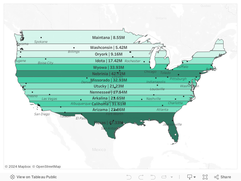
As you can see in the original image, the states of Floxas and Maintana are wider than the 11 other states. I updated the widths accordingly by making these two states larger and shrinking the rest correspondingly.
This entire process had one aim: calculate the X and Y coordinates of each state’s bounding rectangle. The widths correspond to Y (latitude) and the original BR_Left and BR_Right fields to X (longitude).
Finally, with all points calculated, I used the function st_createpolygon to generate polygons for each state. This function is very interesting: it creates a polygon from a set of points or lines in the order in which they are fed into the function. For consistency, I started in the southeast corner of each state and worked clockwise.
The output of these steps can be seen in the map below, where we now have 13 rectangles that span the width of the original bounding rectangle.

Step 4: Create an Intersection Object
We are very close to being done here. In the previous step we performed calculations to get the coordinates of each new state’s rectangle and then generated new polygons from these coordinates. Now all that’s left is to return the intersection between these rectangles and the actual outline of the United States.
To accomplish this, all we must do is connect a Spatial Process tool. This tool allows us to take two spatial objects and perform one of 5 actions on them:
- Combine Objects
- Cut 1st from 2nd
- Cut 2nd from 1st
- Create Intersection Object
- Create Inverse Intersection Object
For this project, I selected “create intersection object.” This action looks at the two spatial objects selected—the US outline and each state’s rectangle—and returns the area in which the two overlap.
The output can be seen below. Each state has now been “clipped” according to the extent of the US outline.

Step 5: Combine Population Data
I could have stopped there. Most people probably would have. But, I figured, I’ve come this far, let’s see how many people live in each of these new states.
To that end, I took a data set from the US Census Bureau that includes population figures and spatial objects for each county in the United States.

At this point, we have two data sets. One which contains spatial objects for our new states and one of county-level population figures. So, one might ask, how do we relate a made-up spatial object with real data?
The answer is through the Spatial Match tool. This tool takes on two inputs, a Target and a Universe, and returns data sets where those two match and don’t match based on a selected operation.
I like to think of the Universe input as the “master.” The Target, then, is compared against the Universe. The operations available include:
- Where Target Intersects Universe
- Where Target Contains Universe
- Where Target Within Universe
- Where Target Touches Universe
- Where Target Touches or Intersects Universe
- Where Target Bounding Rectangle Overlaps Universe
- Custom
Here, I chose “Where Target Intersects Universe.” This gives us an output record each time a county intersects a state spatial object. If a county overlaps multiple states, multiple records will be generated.
The Spatial Match tool is excellent when you want to determine the relationship between two otherwise disparate spatial sources.
Step 6: Create an Intersection between Counties and States
As I mentioned in the previous step, the Spatial Match tool can result in multiple records if a county intersects more than one state. Since my final goal is to count the population of each new state, I used another Spatial Process tool to create an intersection object between the county and state spatial objects.
With this intersection object created, I then used another function, st_area, to calculate the percentage of each county in a given state. For example, I found that about 25% of Bullock County, Alabama was in “Arizama” while the remaining 75% was in “Floxas.”
Finally, I created an adjusted population column by multiplying this overlap calculation with each county’s raw population figure. Using another Summarize tool, I consolidated the data set back into one record per state.
End Results & Considerations
I initially output this data set as a Tableau Hyper Extract. However, when I first opened it in Tableau, the map wasn’t quite what I expected…

If you’re not familiar, there are many different types of map projections. Each type of map projection has a specific use. For example, the Web Mercator is used by Google Maps, Tableau, and Alteryx. This map projection is excellent for navigational purposes, which explains much of its popularity (areal distortions notwithstanding).
When you connect to a spatial file, such as a shapefile, it contains projection information. Tools like Tableau and Alteryx take this information and will reproject the data to the Web Mercator projection. Through our processing, however, that projection information did not exist, so when I put the states output in Tableau, it reprojected the data, creating the map seen above.

To combat this, Alteryx allows you to assign a projection when creating a shapefile output. By selecting a projection, other tools know how to properly map the data.
With disaster averted, I was then able to connect the data set to Tableau to create the final output map. Using a data set of the 1,000 most populous US cities, I leveraged Tableau’s amazing map layers feature to label the 5 largest cities in each of our new states.
You can also view the report here in Tableau Public.
In Closing
I hope you enjoyed this blog post and found it helpful. While Alteryx is not a GIS tool, it is much easier to use than dedicated GIS software such as ArcGIS or QGIS. I was able to build this entire map—including getting data from the Census Bureau and mapping it in Tableau—in about one hour.
Do you have more questions about Alteryx? Talk to our expert consultants today and have all your questions answered!


