

In this blog post, I’m going to teach you how to use the Gauge Chart template.
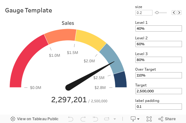
Step 1: Download the Template
Go here and download the template.
Step 2: Update the Data Sources
Open the workbook. Note there are two data sources: gauge_placeholder and “Update this data”. Edit the “Update this data” data source.
In this data source, add a connection to your desired data source.
Edit the “Add to union. Remove Superstore” data object and add your selected data source to the existing union. Then remove the Orders table from the union.
Step 3: Update the Key Metric
In the “Update this data” data source, update the [Key Metric] calculated field (this is in the folder titled 00 – REPLACE THIS METRIC) with an aggregation of your desired target value. It needs to be an aggregation.
Step 4: Update the Target
Update your target value in the [Target] parameter.
Step 5: Customize All Other Parts
Use the parameters to make any additional adjustments.
Conclusion
The gauge chart template is a quick way to create a gauge chart without having to learn the details. If you are interested in learning more about how this chart was created, read the How to Build a Gauge Chart tutorial.


