

In this blog post, I will show you how to create a gauge chart that is extremely customizable, adjustable to your data, and can fit several different scenarios. The final result will allow you to make stylistic changes with a click of a button.
What is a Gauge Chart?
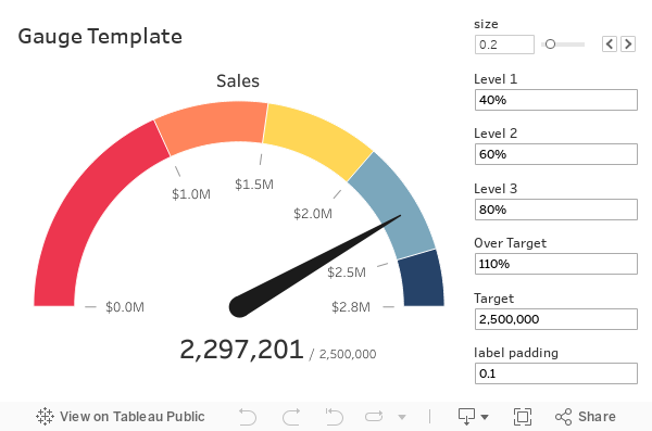
A gauge chart displays the performance of a metric relative to scale using a needle on a dial. Often used on executive dashboards, gauges use the direction of the needle and the color of the dial to help users quickly understand performance.
When Should I Use a Gauge Chart?
A gauge chart is most effective when paired with other gauge charts. This will allow your end-users to better understand the context of current performance relative to expectations.

Before we get started–if you are looking for a simple gauge chart, there are plenty of resources already available, including some of our previous solutions, the Flerlege Twins.
The goal of this solution was to create a gauge chart without images that also looked aesthetically pleasing. This blog post will outline the steps for creating the chart. If you want to skip the tutorial and go straight to a template, you can go here.
If you are staying for the tutorial, I’d recommend you read the following tutorial, as we’ll utilize map layers for this gauge.
Step 1: Make the Dial
To build the gauge, we will create a separate data source. Don’t worry; this data source will work easily with any other data source. The data source has two columns– one column called [value] that counts from 0 to 401 and repeats five times. The second column is called [level], where the numbers in the column range from 1 to 5. This column covers each of the five iterations of the numbers in the [value] column. You can get the data here.
After you have downloaded this data source, connect to the data source in Tableau and make an extract.
On a new sheet, we are going to create five Float parameters. These parameters will help us size the dial on the gauge.
Let’s call the first three [Level 1], [Level 2], and [Level 3]. All three parameters use a range between 0 and 1 with a step size of 0.01. Set the values of [Level 1], [Level 2], and [Level 3] to .4, .6, and .8, respectively.

Create a 4th parameter called [Over Target]. This will also be a Float parameter, but this time the range will be between 1 and 1.5 with a step of 0.01. Set the value to 1.1.

The final parameter will be called [size], and it will help us establish the width of the band on the dial. Set the range between 0 and 1. Set the value to .2.
Now that we have created these parameters, let’s create the calculations that will build our dial. This chart will rely on polar coordinates, so it’ll be a throwback geometry class for some. This means we first need to specify the radius and the degrees of the dial.
To do this, we are going to create four total calculations. First, let’s calculate how far each part of the dial will arc. Create a calculation called [Depth] and type the following:
					// Depth
CASE [Level]
WHEN 1 THEN [Level 1]
WHEN 2 THEN [Level 2]
WHEN 3 THEN [Level 3]
WHEN 4 THEN 1
WHEN 5 THEN [Over Target]
END
Here we are assigning how far each arc should go.
Next, let’s calculate the [Dial Degrees].
					// Dial Degrees
PI()*(IF [Value] <= 200
THEN [Value]/200
ELSEIF [Value] <= 401
THEN (200 - ([Value] - 201))/200
END)*([Depth]/[Over Target])
And then the [Dial Radius].
					// Dial Degrees
IF [Value] <= 200
THEN 1
ELSEIF [Value] <= 401
THEN 1 - [size]
END
With [Dial Degrees] and [Dial Radius] we can then create a map layer called [Dial] that will create the dial for us.
					// Dial
MAKEPOINT(
    [Dial Radius]*SIN([Dial Degrees]),
    -[Dial Radius]*COS([Dial Degrees])
)
Now that you have [Dial] created, Place this map layer onto the visualization this should add [Longitude (generated)] and [Latitude (generated)] to the Columns and Rows shelves. Add [Level] as a discrete dimension to the color. Change the mark type to polygon, then click-and-drag [Value] onto the path as a continuous dimension. Turn off your tooltips.

The result will be the dial to a gauge.
Step 2: Make the Ticks
Now that we have the dial, let’s make the ticks. For this, we will use the same data source we’ve used for the dial.
First, create a float parameter called [Tick Length]. This will determine the length of the ticks. Use a range between .01 and .15 with steps of .01. Set the value to .05.
We’ll need to create 3 calculations: [Tick Degrees], [Tick Radius], and [Ticks].
					// Tick Radius
IF [Value] IN(0, 1, 2, 3, 4, 5)
AND [Level] = 1
THEN 1 - [size] - .05 - [Tick Length]
ELSEIF [Value]  IN(6, 7, 8, 9, 10, 11)
AND [Level] = 1
THEN 1 - [size] - .05
END
					// Tick Degree
CASE [Value]
WHEN IN(0, 6) THEN 0
WHEN IN(1, 7) THEN [Level 1]
WHEN IN(2, 8) THEN [Level 2]
WHEN IN(3, 9) THEN [Level 3]
WHEN IN(4, 10) THEN [Over Target]
WHEN IN(5, 11) THEN 1
END * PI()/[Over Target]
					// Ticks
MAKEPOINT(
    [Tick Radius]*SIN([Tick Degrees]),
    -[Tick Radius]*COS([Tick Degrees])
)
Once you have created [Ticks], click-and-drag this calculation over to the existing sheet and add the calculation as an additional map layer.

After adding the map layer, change the mark type to Line. Add [Tick Degrees] to detail as a continuous dimension. Add Value to the path as a continuous dimension, then set the size to the smallest value possible.

One item not discussed up until now is what [Level 1], [Level 2], [Level 3], and [Over Target] provide to the visual. If you update the values in these parameters, it will change how the dial is colored. In general, you will want [Level 1] < [Level 2] < [Level 3] < 1 < [Over Target]. If you update, you will see how the color is adjusted on the dial.
If you also adjust the size, you will see how that value increases or decreases the band size of the dial.
So far, we’ve created a gauge chart that can be applied to any data source. For the next part, we will connect to a data source and build the gauge chart.
Step 3: Make the Pointer
For this example, we will connect to the Sample – Superstore data source. As you build your data source, you will create a logical join (relationship) between your data source and a second data source you will need to build.
Using your tool of choice, create a CSV with a single column called Point that counts up from 1 to 20.

Name this data source “placeholder.csv”. Then create an additional connection to the data source.

Create a logical join between Sample – Superstore and placeholder.csv. Create calculated joins and set the value of each side of the join to 1. This will create a many-to-many relationship but won’t affect any of the work we’ll do.
Once again, we need to calculate the radius and degrees then create a map layer. We will utilize the join that we created to build the calculations. You need to build these calculations using the data source containing your key metrics. For this example, it is Sample – Superstore.
But before we build the calculations, we need to set a target. For this example, we will code a sales target in a float parameter called [Target]. Let’s set the target to 2,000,000.
We also need to define a key metric. This is the value we are going to compare to the target. For this example, I am going to use total sales. In a new calculated field called [Key Metric], let’s create that total.
					// Key Metric
SUM([Sales])
Now, let’s calculate the degrees of the pointer. Create a calculated field called [Point Degrees] and type the following:
					// Point Degrees
CASE [Point]
WHEN 1 THEN 0
WHEN 2 THEN MIN({[Key Metric]}/[Target]/[Over Target],1)
END * PI()
With this calculation, you are defining values to the first to rows of the placeholder.csv data source. For Point 1, the pointer is centered at 0. For Point 2, the value is defined at a percent relative to the target. If that target goes over the maximum value, it will just put the arrow all the way to the top of the gauge.
Next, let’s calculate the [Point Radius]:
					// Point Radius
CASE [Point]
WHEN 1 THEN 0
WHEN 2 THEN 1 - [size]/2
END
This will put the point in the middle of the dial.
Now let’s create the map layer. Call it [Gauge Point].
					// Gauge Point
MAKEPOINT(
  [Point Radius]*SIN([Point Degrees]),
 -[Point Radius]*COS([Point Degrees])
)
Take the [Gauge Point] calculation and add the map layer to the visualization on the sheet. Thanks to map layers, you can add multiple data sources to the same map in Tableau without performing a blend.
Rename the layer to Point. Change the mark type to the line. Add [Point] as a continuous dimension to the path.
Create a new calculation called [Point Size]:
					// Point Size
CASE [Point]
WHEN 1 THEN 10
WHEN 2 THEN .2
END
Add point size to size. Adjust the size to your liking for the pointer. Change the color to black.

Your gauge is now functional, but it still needs labels.
Step 4: Add the Labels
To add the labels, we once again need to calculate the degrees and radius of these points–then we can add labels.
Create a float parameter called [label padding]. This will provide spacing between the end of the tick and the labels. Set the value to 0.1. The benefit to using a parameter for this is that as you resize your gauge, you can quickly update the parameter to add spacing accordingly.
Add a calculation for [Labels Degrees] and [Labels Radius] to the Sample – Superstore dataset.
					// Label Degrees
CASE [Point]
WHEN 1 THEN [Level 1]
WHEN 2 THEN [Level 2]
WHEN 3 THEN [Level 3]
WHEN 4 THEN 1
WHEN 5 THEN [Over Target]
WHEN 6 THEN 0
END * PI()/[Over Target]
					// Labels Radius
CASE [Point]
WHEN IN(1, 2, 3, 4, 5, 6) THEN 1 - [size] - .05 - [Tick Length] - [label padding]
END
Use these two calculations to build a map layer called [Labels]:
					// Labels
MAKEPOINT(
    [Labels Radius]*SIN([Labels Degrees]),
    -([Labels Radius] - .05)*COS([Labels Degrees])
)
If you notice very closely, there is an additional -.05 in the make point calculation. That is to adjust the left-right because the text is typically wider than it is tall.
Add the [Labels] map layer to the visualization. Change the layer name to Labels. Change the mark type to text. Add [Point] as a continuous dimension to detail.
Create a new calculation called [Labels Key Metric] that will be used for the labels:
					// Labels Key Metric
CASE [Point]
WHEN 1 THEN [Level 1]
WHEN 2 THEN [Level 2]
WHEN 3 THEN [Level 3]
WHEN 4 THEN 1
WHEN 5 THEN [Over Target]
WHEN 6 THEN 0
END * [Target]
This calculation leverages the parameters used for the gauge size as well as the target to create the labels automatically.
Add [Labels Key Metric] to text and format your text.

We are almost complete with the build. The last part is adding labels, including the actual values and the target to the gauge.
Step 5: Add Labels
First, let’s add a title. Create a calculation called [KPI Name].
					// KPI Name
MAKEPOINT(1.1, 0)
Add [KPI Name] as another map layer. Change the layer name to Title. Change the mark type to text. Create a new text parameter called [KPI Name], Set the value to Sales. Edit the text so the title is larger than the tick labels. For this example, I’ll set the value to size 11 font.
Now let’s add labels for the key metrics. Create a calculation called [KPI].
					// KPI
MAKEPOINT(-.2, 0)
Add this calculation as another map layer. Keep the layer name the same. Change the mark type to text. Add [Key Metric] and [Target] to text. Edit and format the text to your preference.

This will result in the following:

Step 6: Finalize Your Visualization
In the last step, you have to do some minor clean-up. First, take the “Point” map layer, click and drag the layer above the “Labels” map layer. You are doing this so the gauge sits above the labels on the visualization.
Next, change the colors on the dials. This will make the chart easier to interpret.
After that, set the background maps to none. You can do this by going to Maps on the top menu, then going to the Background Maps, and then selecting None.

This will turn off lots of the mapping and open up some additional formatting. After this step, your chart might look like this:

First, edit your axes. Set your longitude to be between -1.1 and 1.1. Set your latitude axis to be between -0.4 and 1.2. Then hide these axes.
Next, hide all rulers, lines, ticks, and dividers on the sheet.
Then, hide your nulls.
For the last step, click on color on the “Dial” layer and set the border to white.

This will complete the build of your gauge. All you need to do is add it to your dashboard somewhere. As you add it to a dashboard, remember the ideal ratio is eight units tall for every 11 units wide. This will keep the gauge looking circular in nature.

Conclusion
The goal of this tutorial was to create a gauge chart that is worthy of placing on any dashboard. On top of that, I wanted to make it extremely customizable by using map layers and parameters. With map layers, you can turn on or off any part of the gauge chart. With parameters, you can quickly change the size of almost any component to display the information of interest.
If you want to short-cut the development of the gauges, you can always download our gauge template.
Do you have more questions about Tableau? Reach out to our team of experts!
Frequently Asked Questions
1.Where can I get the underlying data:
First. you need your data.
Second, you will need two templated data sources.
The gauge_placeholder dataset is located here. You can download the template if you would like, but this data will not need editing.
The second data source is a .csv you must combine with your data source. The blog contains a section on how to create this data, but if you prefer to download it, you can get it from this tab of the same file. Be sure to download it as a CSV.
Also, when you edit the data, you’ll need to have your files ready to go. When you go to edit your data source, Tableau may prompt you for both your data and the templates–if this happens, don’t fret. Just download the data.
If you are connecting your data from a database rather than an excel file (which is what is used for the demo purposes): Find a copy of “Sample – Superstore” on your machine and use that initially. After you can access the following screen:

Add a new connection and replace the “Add to union…” with your data set.
Then create a new join where both sides contain a calculated join where the values for both of the join are equal to TRUE.
2.How can I add filters?
Yes, add your measure as a filter and then set the filter as a context filter. You can test it out by adding [Region] as a filter and then add it to context.
3.How do I change the start value?
If you work with something like NPS data and the range starts in the negatives, here’s how you can do it.
You need to edit both data sources:
1. Click on the gauge_placeholder dataset.
2. Edit the [Depth] calculation
This function includes inputs from 4 parameters: [Level 1], [Level 2], [Level 3], and [Over Target].
Each of these are expressed as a percentage currently. If you are working with whole numbers, that’s okay, you just need to transform them into percentages. For this example, I’m going to transform the values into NPS scores that range from -100 to 100.
For this example I am going to use NPS where values range from -100 to 100. I’m going to set [Level 1] to 0, [Level 2] to 25, [Level 3] to 25, and [Over Target] to 100. I’m also going to update the hardcoded of values of 1 to 50.
I also need to normalize my data back to its between 0 and 1. To do this, I am going to hardcode in my minimum value to be -100 and maximum value to be 100. Here’s the calculation that I’ll use. You need to insert your values where it reads <<Minimum Value>> and <<Maximum Value>>.
					(CASE [Level]
WHEN 1 THEN [Level 1]
WHEN 2 THEN [Level 1]
WHEN 3 THEN [Level 3]
WHEN 4 THEN 50
WHEN 5 THEN [Over Target]
END + <<Minimum Value>>)/(<<Maximum Value>> - <<Minimum Value>>)
You can choose to hardcode your data or have it dynamically calculated. If I were to hardcode the data I would just type in -100 and 100 for the respective calculations. Or you could derive it with calculations in your data.
3. Edit the [tick degrees] calculation. This calculation controls what is seen where.
To better understand what is there already, let’s take a look at the calculation:

Remember you’ve already set [Level 1] to 0, [Level 2] to 25, [Level 3] to 25, and [Over Target] to 100. I’m also going to update the hardcoded of values of 1 to 50 (my target NPS score) and 0 to -100.
Now you just need to normalize everything with minimum values (which are -100). I’m also going to update the location of PI().
					PI() * ((CASE [Value]
WHEN IN(1, 6) THEN [Level 1]
WHEN IN(2, 7) THEN [Level 2]
WHEN IN(3, 8) THEN [Level 3]
WHEN IN(4, 9) THEN [Over Target]
WHEN IN(5, 10) THEN 50
WHEN IN(11, 12) THEN -100
END - <<Minimum Value>>)/([Over Target] - <<Minimum Value>>))
4. Click on the “Update this data” data source.
5. Edit the [Point Degrees] calculation:
Change the calculation to
					CASE [Point]
WHEN 1 THEN 0
WHEN 2 THEN MIN(({[Key Metric]} - <<Minimum Value>>)/(<<Maximum Value>> - <<Minimum Value>>),1)
END * PI()
Here you will need to update the minimum and maximum values–in the case of the NPS the <<Minimum value>> is -100 and the <<Maximum Value>> is 100.
6. Edit the [Label Degrees] calculation and update it to:
					PI() * ((CASE [Point]
WHEN 1 THEN [Level 1]
WHEN 2 THEN [Level 2]
WHEN 3 THEN [Level 3]
WHEN 5 THEN [Over Target]
WHEN 4 THEN 50
WHEN 6 THEN <<Minumum Value>>
END - <<Minumum Value>>)/(<<Maximum Value>> - <<Minumum Value>>)
)
4. How do I create dynamic values?
From the previous answer, you need to update 4 calculations: [Depth], [tick degrees], [Point Degrees], and [Label Degrees]. Use the new calculations and update the <<Minimum Value>> and <<Maximum Value>> placeholders with relevant values.
Any place where you see 50. For the example above the target was a score of 50 on NPS. If your data includes a field that has the target you can replace the value with:
{SUM([Target Metric])}
If you want your Maximum Value to be dynamic replace <<maximum value>> with: {SUM([Target Metric])}*[percentage above 100%].
An example would be {SUM([Sales Target)} * 1.1
5. How do I change from a number to a percentage?
Edit the [Labels Key Metric] calculation and remove “*[Target]”:
CASE [Point]
WHEN 1 THEN [Level 1]
WHEN 2 THEN [Level 2]
WHEN 3 THEN [Level 3]
WHEN 4 THEN 1
WHEN 5 THEN [Over Target]
WHEN 6 THEN 0
END
6. What if my data is a different level of detail?
It should work fine for different levels of detail.


