

Gauge charts are an incredibly powerful way to visualize progress and targets. They are ideal for showing a single metric’s status relative to a specific goal, allowing an instant glance at performance analysis against a threshold.
In this blog, we’ll look at how you can use Omni’s native tools to create a Gauge chart using Vega-lite.
What is a Gauge Chart?
Even with a data-rich dashboard, the most pressing query is often whether the defined target is being met.
This is where the Gauge chart, also known as a speedometer or dial chart, comes in. It’s the most effective way to eliminate dashboard clutter and deliver an immediate, visual assessment of a single critical performance metric.
Gauge charts are ideal for monitoring Key Performance Indicators (KPIs) on a dashboard because they let users immediately see whether a metric is on track, falling behind, or exceeding expectations.
How do phData’s Clients Leverage Gauge Charts?
How much further do we need to go?
The gauge serves as a visual representation of advancement towards a target, such as quarterly revenue goals. Instead of simply seeing a number (ex- $45,000), the Gauge instantly shows you the progress, indicating that you are 45% of the way there. Teams can quickly assess whether they are ahead of schedule, on target, or need to exert additional effort to meet the deadline.For non-technical users, they offer a fast visual overview of a metric’s current status, enabling executives and operational personnel to instantly grasp critical information without getting bogged down in data.
How to Build a Gauge Chart in Omni with Vega-lite
Let us consider the following scenario: we want to compare Total sales to a defined Max Sales value and show progress in a Gauge Chart.
In Omni, the Gauge Chart is not a default chart, but we can create this type of custom chart using Vega-Lite.
Let’s get started with this build.
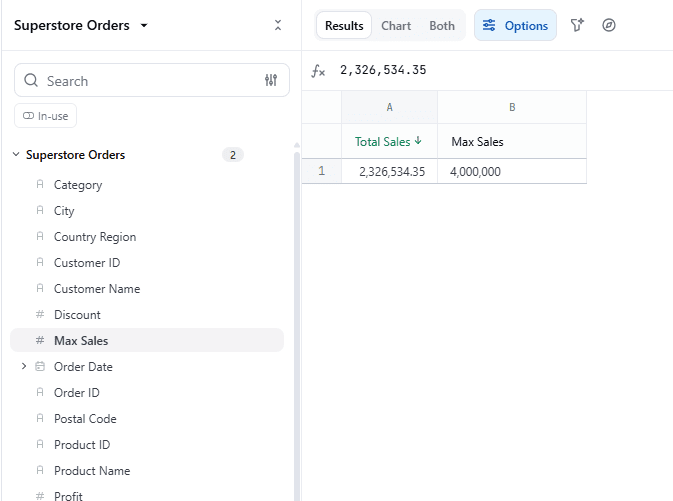
Step 1
After adding the aggregated Sales Value, click on the Add new calculation column icon on the right.
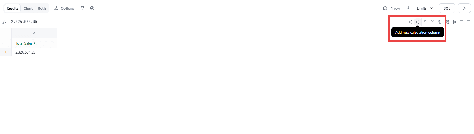
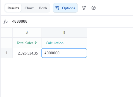
Add the Value in the new column and rename the column (like Max Sale)
Step 2
After adding the calculated column, promote it to the workbook by clicking on the ellipsis and selecting Promote to Workbook.
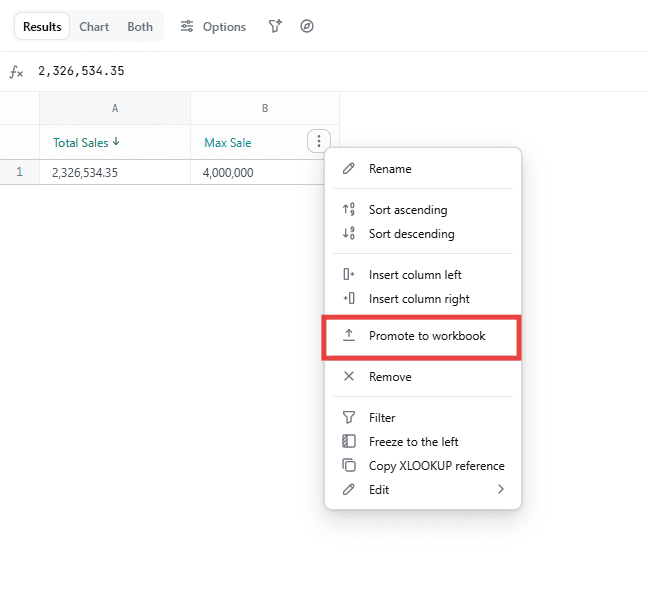
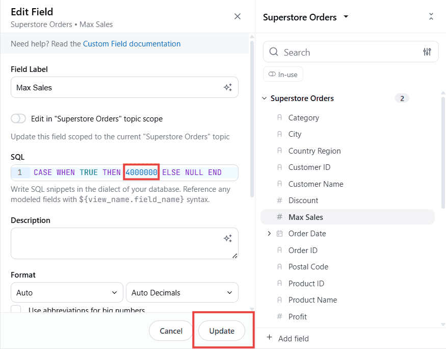
The value of this Calculated Column can be changed by clicking on the ellipsis beside the field and selecting Edit.
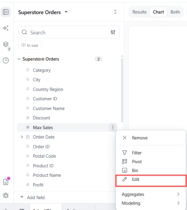
You can change the value in the SQL field and Update.
Step 3
To begin building the chart, click on the Chart option at the top.
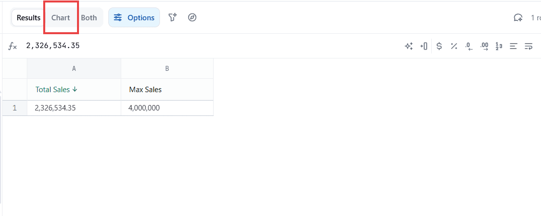
Omni will automatically assign a default chart.
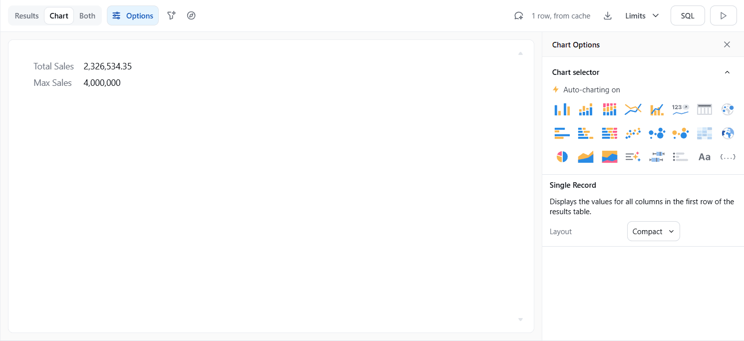
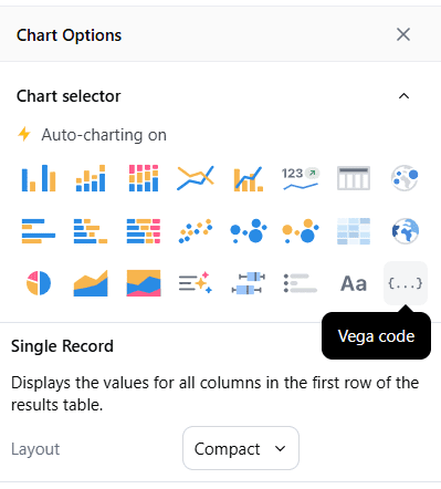
From the Chart option, click on the Vega Code option.
There are 2 options to create the chart: either give the AI a prompt and it will generate Vega-Lite code for the visual, or write your own Vega-Lite code.
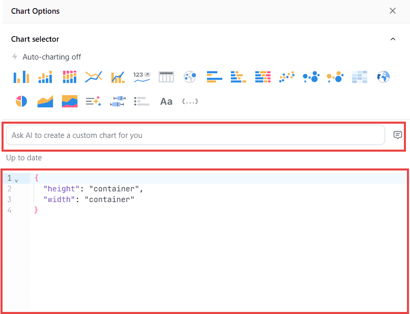
The code generated by the AI will need some tweaks to get the desired result.
If we’re going to provide our own code, we need to type it or paste it into the container below.
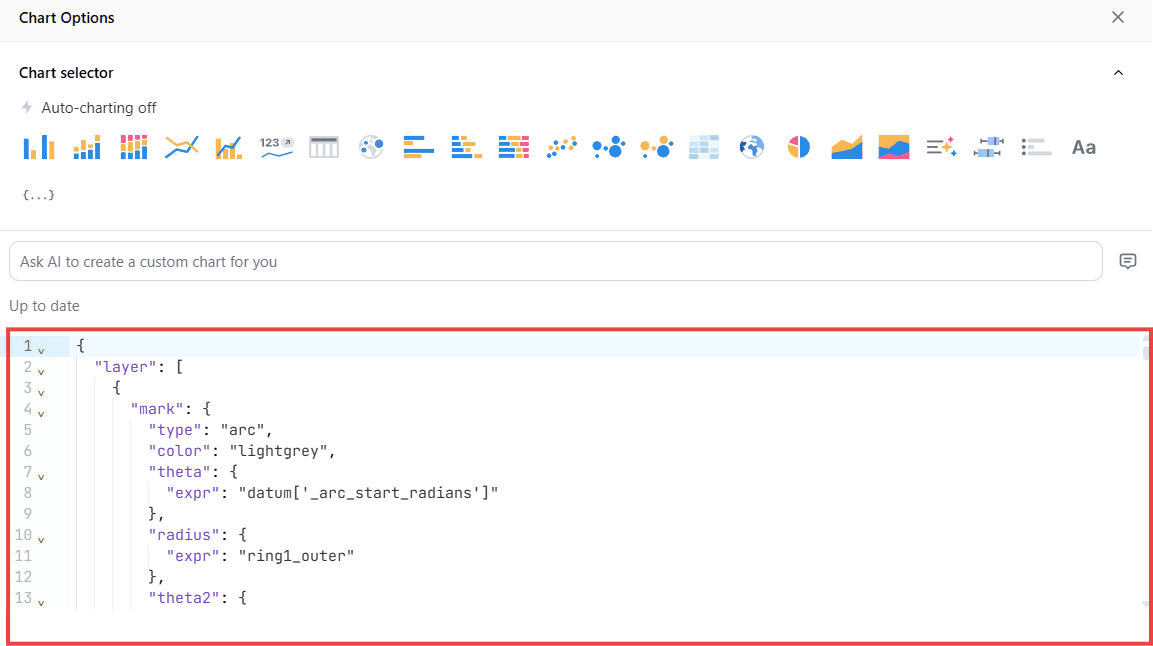
Here’s the code for Gauge Chart:
					{
  "layer": [
    {
      "mark": {
        "type": "arc",
        "color": "lightgrey",
        "theta": {
          "expr": "datum['_arc_start_radians']"
        },
        "radius": {
          "expr": "ring1_outer"
        },
        "theta2": {
          "expr": "datum['_arc_end_radians']"
        },
        "radius2": {
          "expr": "ring1_inner"
        },
        "description": "Background of the gauge.",
        "cornerRadius": 0
      }
    },
    {
      "mark": {
        "type": "arc",
        "theta": {
          "expr": "datum['_ring_start_radians']"
        },
        "radius": {
          "expr": "ring1_outer"
        },
        "theta2": {
          "expr": "datum['_ring_end_radians']"
        },
        "radius2": {
          "expr": "ring1_inner"
        },
        "cornerRadius": 0
      },
      "name": "RING",
      "encoding": {
        "color": {
          "type": "quantitative",
          "field": "percentagex100",
          "scale": {
            "range": [
              "#FF0000",
              "#00FF00"
            ],
            "domain": [
              0,
              100
            ]
          },
          "legend": {
            "title": "Completion %",
            "orient": "top-right"
          },
          "description": "Gradient color for the gauge ring — red (low) to green (high)."
        }
      }
    },
    {
      "mark": {
        "type": "text",
        "fontSize": 45
      },
      "encoding": {
        "text": {
          "field": "percentage_text",
          "format": "text",
          "formatType": "omniNumberFormat"
        },
        "color": {
          "type": "quantitative",
          "field": "percentagex100",
          "scale": {
            "range": [
              "#FF0000",
              "#00FF00"
            ],
            "domain": [
              0,
              100
            ]
          },
          "description": "KPI text color dynamically changes from red (low) to green (high)."
        },
        "tooltip": [
          {
            "type": "quantitative",
            "field": "omni_superstore__superstore_fact\\.sales_sum",
            "title": "Sales",
            "format": ",.2f"
          },
          {
            "type": "quantitative",
            "field": "omni_superstore__superstore_fact\\.max_sale",
            "title": "Target",
            "format": ",.2f"
          },
          {
            "type": "nominal",
            "field": "percentage_text",
            "title": "Completion %"
          }
        ]
      }
    }
  ],
  "width": "container",
  "config": {
    "concat": {
      "spacing": 0
    },
    "autosize": {
      "type": "fit",
      "resize": true,
      "contains": "padding"
    }
  },
  "height": "container",
  "params": [
    {
      "name": "ring_max",
      "value": 120
    },
    {
      "name": "ring_width",
      "value": 35
    },
    {
      "name": "ring_gap",
      "value": 5
    },
    {
      "name": "label_color",
      "value": "#000000"
    },
    {
      "name": "ring_background_opacity",
      "value": 0.3
    },
    {
      "name": "ring0_percent",
      "value": 100
    },
    {
      "expr": "ring_max+2",
      "name": "ring0_outer"
    },
    {
      "expr": "ring_max+1",
      "name": "ring0_inner"
    },
    {
      "expr": "ring0_inner-ring_gap",
      "name": "ring1_outer"
    },
    {
      "expr": "ring1_outer-ring_width",
      "name": "ring1_inner"
    },
    {
      "expr": "(ring1_outer+ring1_inner)/2",
      "name": "ring1_middle"
    },
    {
      "expr": "220",
      "name": "arc_size"
    }
  ],
  "transform": [
    {
      "as": "percentage",
      "calculate": "datum['omni_superstore__superstore_fact.sales_sum'] / datum['omni_superstore__superstore_fact.max_sale']",
      "description": "Calculates the percentage for the gauge fill."
    },
    {
      "as": "percentagex100",
      "calculate": "(datum['omni_superstore__superstore_fact.sales_sum'] / datum['omni_superstore__superstore_fact.max_sale'])*100",
      "description": "Calculates the percentage for the gauge fill."
    },
    {
      "as": "percentage_text",
      "calculate": "format(datum['percentage'] * 100, '.1f') + '%'",
      "description": "Formats percentage as text with 1 decimal place for the KPI display."
    },
    {
      "as": "_arc_start_degrees",
      "calculate": "360 - (arc_size / 2)"
    },
    {
      "as": "_arc_end_degrees",
      "calculate": "0 + (arc_size / 2)"
    },
    {
      "as": "_arc_start_radians",
      "calculate": "2 * 3.14 * (datum['_arc_start_degrees'] - 360) / 360"
    },
    {
      "as": "_arc_end_radians",
      "calculate": "2 * 3.14 * datum['_arc_end_degrees'] / 360"
    },
    {
      "as": "_arc_total_radians",
      "calculate": "datum['_arc_end_radians'] - datum['_arc_start_radians']"
    },
    {
      "as": "_ring_start_radians",
      "calculate": "datum['_arc_start_radians']"
    },
    {
      "as": "_ring_end_radians",
      "calculate": "datum['_arc_start_radians'] + (datum['_arc_total_radians'] * datum['percentage'])"
    }
  ]
}
Field Name should follow this notation: omni_superstore__superstore_fact\\.max_sale
| Usage Area | Syntax | Why |
|---|---|---|
Expressions/calculate |
| JavaScript-style access |
Encodings/tooltip/axis |
| JSON field reference |
Step 4
The Gauge Chart will be visible in the chart pane.
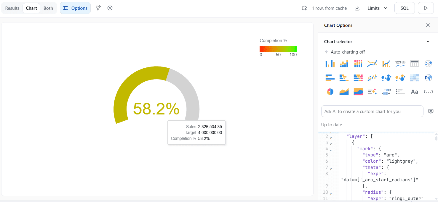
The decimal values and colors can be tweaked by changing the Vega-lite code itself.
Best Practices
Some of the best practices we recommend following are:
- Follow the naming convention supported by Omni; otherwise, the visual won’t appear.
-
Use Color Bands for Context to define Red/Yellow/Green zones on the scale, making performance instantly definable and actionable.
Closing
As demonstrated in this blog, you can build gauge charts and also other custom charts in Omni using Vega-Lite. This gives you the ability to customize your dashboard according to your needs and include charts, even if they are not built into Omni.
Omni offers a great mix of built-in tools for making different kinds of charts with the option to integrate Vega-Lite and HTML components for even more customisation. This enables you to design stunning, informative dashboards that support business decision-making.

Need help moving from experiments to production-ready Omni dashboards?
phData can work with your team to design, build, and operationalize the custom visuals and analytics your business needs.
FAQs
What is Vega-Lite?
Vega-Lite is a high-level grammar of interactive graphics. It provides a concise, declarative JSON syntax to create an expressive range of visualizations for data analysis and presentation. Learn more info here.
How to build custom visuals in OMNI?
In Omni, you can build custom visuals using two methods. Either leverage the iframe tag in the markdown tile or use vega-lite to build a new viz or customize the existing one as needed. Check out the documentation here!


