

Google Data Studio (GDS) is a relatively little known data visualization tool produced (obviously) by Google. It is situated as an alternative to Tableau, and the two products do share many similarities.
I was interested in comparing these two tools. As a Tableau user for the last few years, I wanted to see how Tableau’s competitors stack up.
In this post, I will try to replicate Tableau’s Superstores sample workbook in GDS to see how it stacks up against the competition.
Data Connectors
Before we can even think about building charts and dashboards in GDS, we must first get some data in there.
As of late October 2019, GDS can accept 18 Google-built connectors and 156 partner-built connectors.

The partner-built connectors give you access to many web-based data sources, such as Amazon Ads, data.world, Instagram, Facebook, and Twitter.
Google Data Studio has a sizable advantage over Tableau on pre-built web data connectors and is deeply ingrained within the Google ecosystem.
Both tools allow developers to create custom web data connectors.
Unfortunately, GDS cannot connect natively to an Excel file – you will first need to convert your Excel files to a CSV or Google Sheets format. Additionally, GDS cannot connect to spatial or statistical files, and Tableau offers built-in connectors for many more popular databases.
Loading Superstore Data
If you navigate to your Tableau repository, you can find the Superstore data set. Of course, it’s an Excel file, so the first thing is to save a copy as a CSV or Google Sheets file. For this example, I’ve chosen to use Google Sheets to test how well GDS connects with Sheets.

Once you have connected your data source, you’ll see the data editor page, which is very similar to Tableau’s. Field metadata – data type, aggregation, description, etc. – can be changed here. One interesting thing to note: GDS uses green to denote dimensions and blue for measures — the exact opposite of Tableau’s color scheme. You can also create calculated fields at this stage.
GDS seamlessly connected to the Sheets data source, and now we’re ready to build vizzes.
Building a Dashboard
This is the dashboard that I will try to replicate. We’ve got KPIs, a filled map, several stacked area charts, and some filters. This should be a very good test for GDS.

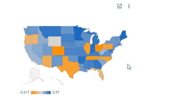
The Map
I like maps, so let’s try to build this map first. The states are colored by profit ratio, which is defined as the sum of profit divided by the sum of sales for each state. So… how do I create a calculated field?
In the bottom-right corner, there is a button labeled “Create New Field,” which opens a menu to create a calculated field. This seems to work much like it does in Tableau, and I had my Profit Ratio calculation a few seconds later.

In Tableau, to construct a dashboard you must first create your charts on individual sheets and add them to the dashboard. In GDS, however, you add charts directly to the dashboard. There also isn’t a distinction between floating and tiled elements; rather, all elements are placed on a grid you snap edges along. Designing with this interface was fast and easy.
Building the map itself was very easy. There are no viz-in-tooltips like in Tableau, but I could add optional measures to the map which act like parameters in Tableau.
The Area Charts
The next vizzes I tried to create were the stacked area charts, and this is where I hit my first roadblock. GDS didn’t recognize the Order Date field as a date; okay, I thought, I’ll just change the data type to “Date” and move on. Nope. Unlike Tableau, which can recognize like a thousand date formats, GDS can only recognize a few, and you have to explicitly state which type it is at the data editor-level.
At this point, I figured I had two options: go back to Google Sheets and fix my date format there or write a calculated field to rearrange the days, months, and years into the proper format. I chose the former. Thankfully, Google Sheets has a TEXT function like in Excel, so it was an easy fix there.

This is where working with dates really frustrated me. I was finally able to make this chart, but…

I wanted to aggregate the date to show monthly sales rather than daily, which was the default. There is an option that reads “Show As,” and when I changed that value from “Auto” to “Year Month” I got an error. Changing the value back to “Auto” didn’t remove the error for some reason, so I ended up deleting and recreating the chart.
Additionally, I could not find a way to split the chart into three panes for the three values for “Segment,” so I opted to put them into one area chart. GDS also has no support for level-of-detail calculations, so I wasn’t able to replicate the coloring from the Tableau example.

The Filters
I was able to easily replicate the Regions filter. Dimension filters are simple in GDS, so no problems there.
I ran into another issue with dates, this time when adding a date filter. Each chart in the dashboard has a field named “Date Range Dimension,” and I was confused about which of my date fields should go here: the one formatted as YYYYMMDD or the YYYYDD field?
Through some trial and error, I found that I needed the YYYYDD date field. Once I connected that date to all charts, the filter worked like a charm.
To me, however, the biggest issue with filters was my inability to create a measure filter. Maybe it’s on me; maybe there is a way to build a measure filter, but I couldn’t figure it out nor find an example of one online. How on earth does a visualization tool not allow me to do this?
And GDS, if it is possible I apologize, but why wasn’t I able to figure it out easily? This is something I could do in Tableau within 15 minutes of launching the tool.
Enough of me being cranky; it’s out of my system now. Check out the embedded dashboard that I put together. I encourage you to interact with it – use the filters, hover over values, and so on. You can even click on a state within the map to filter the other charts for just that state.
Pros of Google Data Studio
- GDS is free to use.
- GDS works very well within the Google environment. If you already use many Google products, it can be a good option for visualizing your data rapidly.
- As a web-based tool, there is no software to download onto your computer. Startup time is much faster.
- Google regularly updates the tool and adds new features.
- It is possible to swap data sources, but only within other Google environment connectors (e.g. Google Analytics, Youtube Analytics, and Google Ads).
- There are some nice formatting options, such as snap-to-grid, border shadows, and rounded corners.
Cons of Google Data Studio
- There are few Google-built connectors. The large majority are from partners and third-parties, many of which require subscriptions to use.
- There is no Excel connector.
- You cannot color certain charts according to a measure. Bar charts and scatter plots, for example, can only be colored by dimensions.
- Dates are a huge pain to deal with. For such an important data type, I feel that GDS’s handling of dates is terrible.
- No level of detail calculations, parameter controls, set actions, or advanced filtering.
- Very limited ability for table calculations.
- There is no capability for data cleaning or preparation.
The Verdict
In all honesty, I could go on quite a bit longer with the cons. Tableau has spoiled me and using a tool with such major limitations is frustrating.
That being said, GDS is quite capable of making attractive dashboards that can effectively tell a story with your data. If the analyses that you will do are simple, and especially if your data lives in the Google environment, this is a tool that is worth checking out. It’s free, and you can’t beat free.
The problem with GDS being so simplistic is that nothing ever remains simple for long. As soon as your manager sees your good work, he or she will ask for more, and you’ll quickly run into a barrier using GDS.
My final verdict is that GDS is an attractive, easy-to-use tool, which is good for simple analyses within the Google environment. If you’re analyzing your website’s traffic and don’t want to spend money on Tableau, I recommend trying it. If you need to analyze a large amount of complex data, I wouldn’t bother with it at this point. I regularly found myself frustrated using the tool because of the features it lacks.
Do you have more questions about Google Data Studio or Tableau? Talk to our expert consultants today and have all your questions answered!


