

Ever been asked to update a dashboard you didn’t create? Are you handing off a completed dashboard to a client who will now maintain the dashboard? Ever have a dashboard break months down the line and struggle to figure out where to start troubleshooting? In these scenarios, a well-documented Tableau dashboard will be a gift to you.
Consider documentation as an instructional guide to your dashboards. Clear and well-written documentation can be a map that makes troubleshooting or updating dashboards a less painful process. Documentation is like insurance; you don’t appreciate its value until you need it. Developing this skill should be a priority for new Tableau developers and considered as essential as keeping up with changes in features and techniques. Incorporating some of the below practices will have you well on your way to creating helpful documentation.
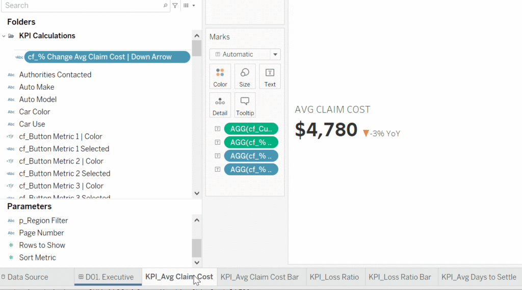
Creating Comments in Dimensions and Measures
Your data source dimension or measure field names may often be unclear or have a specific meaning unique to the data source. A data dictionary or an individual with knowledge of the data source may not be immediately available. Adding a comment to the dimension or field clarifies those fields and serves as a reference for you or your client.
Right-click on the dimension or measure in the Data Pane where you want to add the comment. In the dropdown menu, scroll down to Default Properties and choose Comment…
Add your comment in the Edit Comment pop-up. You can add any text and format in any way you like. Now when you hover over the field name in the Data Pane, the comment will appear.

Creating Comments in Calculated Fields
Tableau also allows you to comment in your calculated fields. In any given workbook, you can create numerous calculated fields. Knowing exactly why you made a calculated field or what it does at the time is easy, but recalling that reason at a later date can lead to frustration and eat up valuable time.
To add a comment to a calculated field, right-click on the field name and choose Edit. In the Edit pop-up, begin your comment by adding “//” to each line of text. If your comment requires multiple lines of text, use “/*” at the beginning and “*/” at the end of the comment (feature available since version 2020.4).

Helpful things to comment on include describing what the calculation does, the logic involved, or where you used the calculation. This space is handy for those one-use calculations, a hacky solution to a requirement, or a multi-step calculation. Do not be afraid to include too much information. You never know what small detail will be helpful in the future.
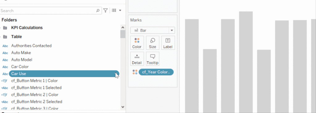
Organizing Fields into Folders
In workbooks that contain multiple dashboards and worksheets, looking for specific fields can be daunting. One way to make this easier is to group your fields into folders. By default, Tableau organizes workbook fields alphabetically by data source table. To organize fields into folders, you must first change this setting.
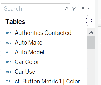
To get the option to create folders, right-click on the down arrow to the right of the View Data icon in the Data Pane and select Group by Folder.
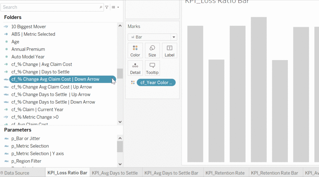
Now we can create folders. Right-click on a field, choose Folders, and then Create Folder. Name your folder and then “OK.” The selected field is moved to the newly created folder. Follow the same steps to add additional fields to the folder but instead of choosing Create Folder choose Add to Folder. Then select the folder name where the field will be placed.
Leveraging Sheet Descriptions
There are multiple locations where you can create dashboard documentation: MS Word, Google Sheets, or a team collaboration software such as Confluence. A way to jumpstart the documentation process is to copy portions of the sheet description into your document.

Click on the worksheet tab and then click CTRL+E or command+E on a Mac. The pop-up will contain detailed information about the fields on the worksheet. Sheet Descriptions which fields are placed on rows and columns, fields placed on the Marks card, calculation formulas, comments, data source name, type of connection, and link to the location of the data source. Copy and paste the information you need into the program of your choice.
Color Coding Worksheets
Color coding worksheets is another simple way to organize and keep track of associated and related worksheets. Organizing worksheets by color serves as a visual cue that can prove helpful with workbooks containing multiple dashboards.
Left-click on the worksheet tab, choose Color, and select a color. The color chosen appears at the bottom of the worksheet tab. In the above example, I have colored worksheets by the dashboard where they appear.
In Conclusion
As the last part of the dashboard development process, documentation can be treated as an afterthought. Although there is no substitute for the original developer’s knowledge of a dashboard, good documentation can be the next best thing. Incorporating these tips can make this process easier to complete and more beneficial for the next developer or future you.


