With regular updates and new features, Sigma Computing has been developing quickly. Sigma has made significant progress in terms of dashboard layout options. Before the Grid layout completely replaced the Classic version, users had the option to select between two primary layouts: Classic and Grid.
But as of right now, Sigma has a flexible, responsive grid-style layout for dashboards, which can be further organized using various layout elements like containers, tabbed containers, rather than predefined “core dashboard layout options”, each appropriate for a distinct set of requirements and use cases.
In this blog, we’ll go over every dashboard layout option that Sigma currently offers, as well as when and why you might select one over another.
How Do Dashboards Work in Sigma?
Dashboards developed using Sigma Computing are data-centric, interactive views that combine tables, visualizations, and text objects into one cohesive display. In contrast to the majority of BI applications, Sigma dashboards work with real-time data and do not require a data refresh on a frequent basis. Sigma supports exploration, detail drilling, and filter application to provide seamless dashboard engagement.
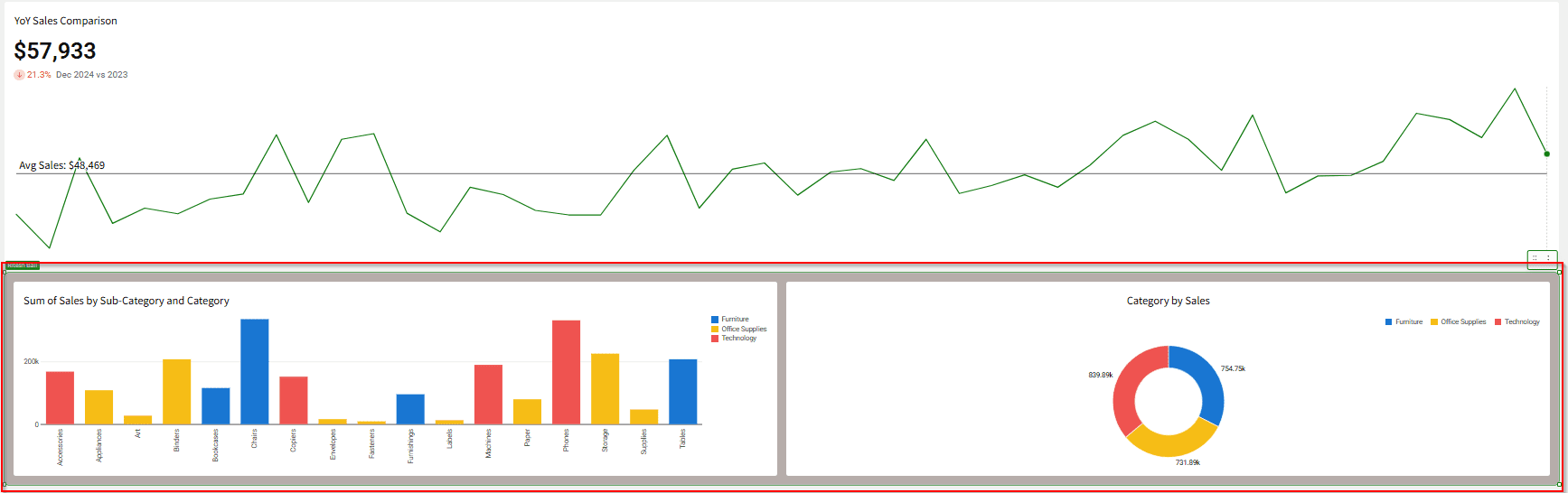
The core of the layout design is a drag-and-drop, responsive grid system. Users can arrange elements (charts, tables, text, images, etc.) on the canvas, and a “snap-to” grid helps with alignment and spacing.
When a chart is moved and placed within the dashboard, a grid layout is displayed to provide assistance with correct alignment.
Containers
These elements allow users to group related components together. Containers can be customized with specific styling (background color, borders, padding) and have their own internal grid density settings (low, medium, or high column density) to manage how elements within them are arranged.
Charts of the same verbal type can be grouped together in the dashboard and formatted separately with different colors, borders, and other formatting options, separate from the other charts.
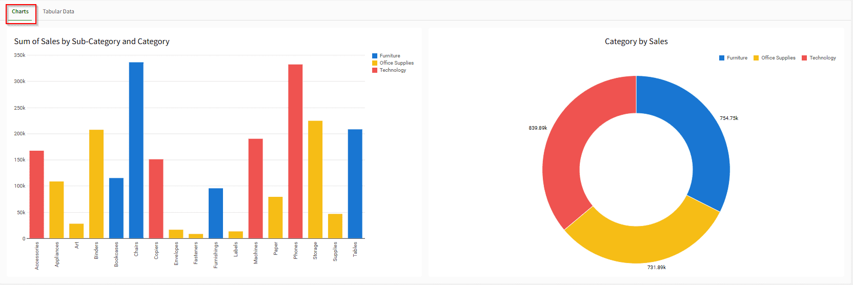
Tabbed Container
A type of container that allows grouping elements into different tabs, reducing visual clutter and organizing content by concept or category within the same page.
The Tabbed container, showing a button at the top left (the tabs) that allows a user to toggle between different tabs, or pages. The Charts tab is shown active here.
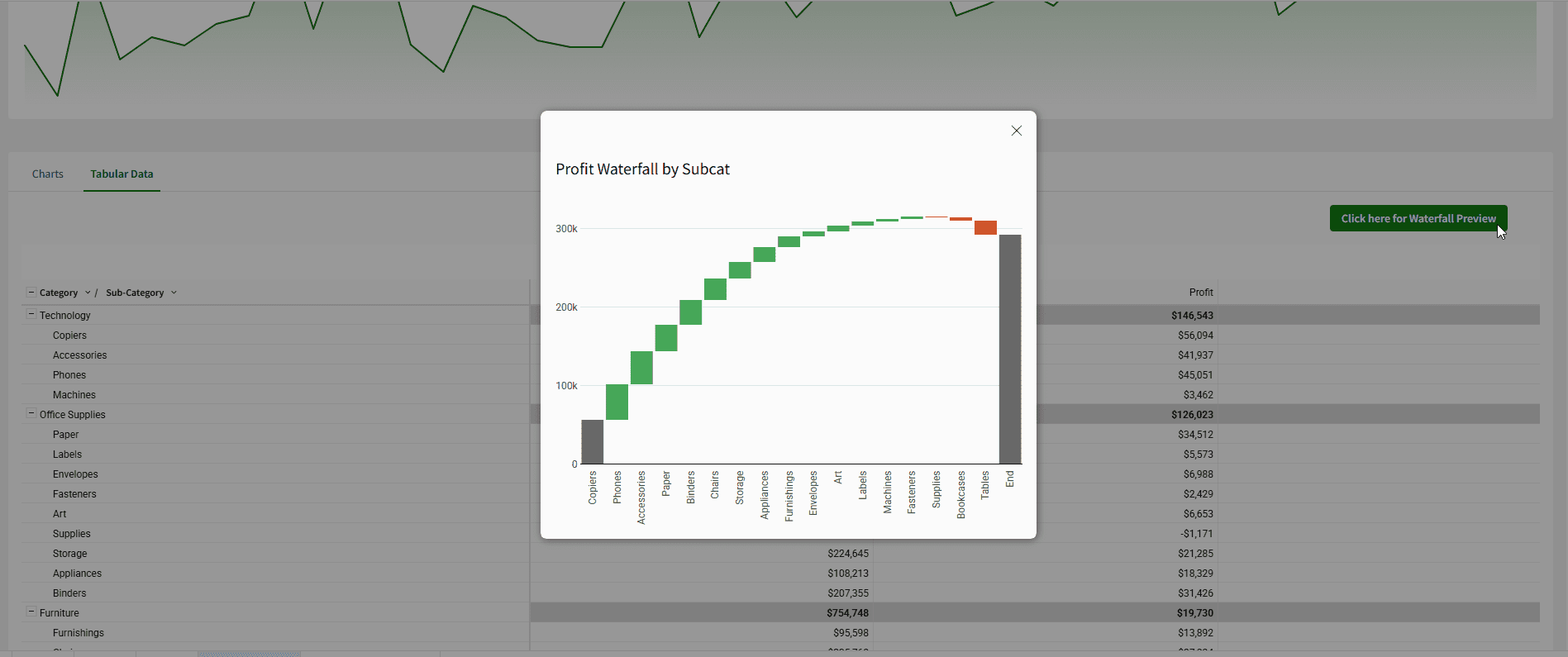
The Tabular Data tab, showing the Profit Ratio table.
Modals
These are page-like overlays that can be triggered by an action. They are useful for managing complex user workflows or inputs without navigating away from the main dashboard.
Modals can be used when you want to:
Spotlight a particular element or set of elements.
Add elements to a dashboard without creating an additional page.
Provide an app-like experience for user data entry.
As an example, the button can trigger an overlay with an additional visualization.
When the Modal button is clicked, the action brings the user's attention to a new window that pops up; in this example, it is a simple waterfall chart.
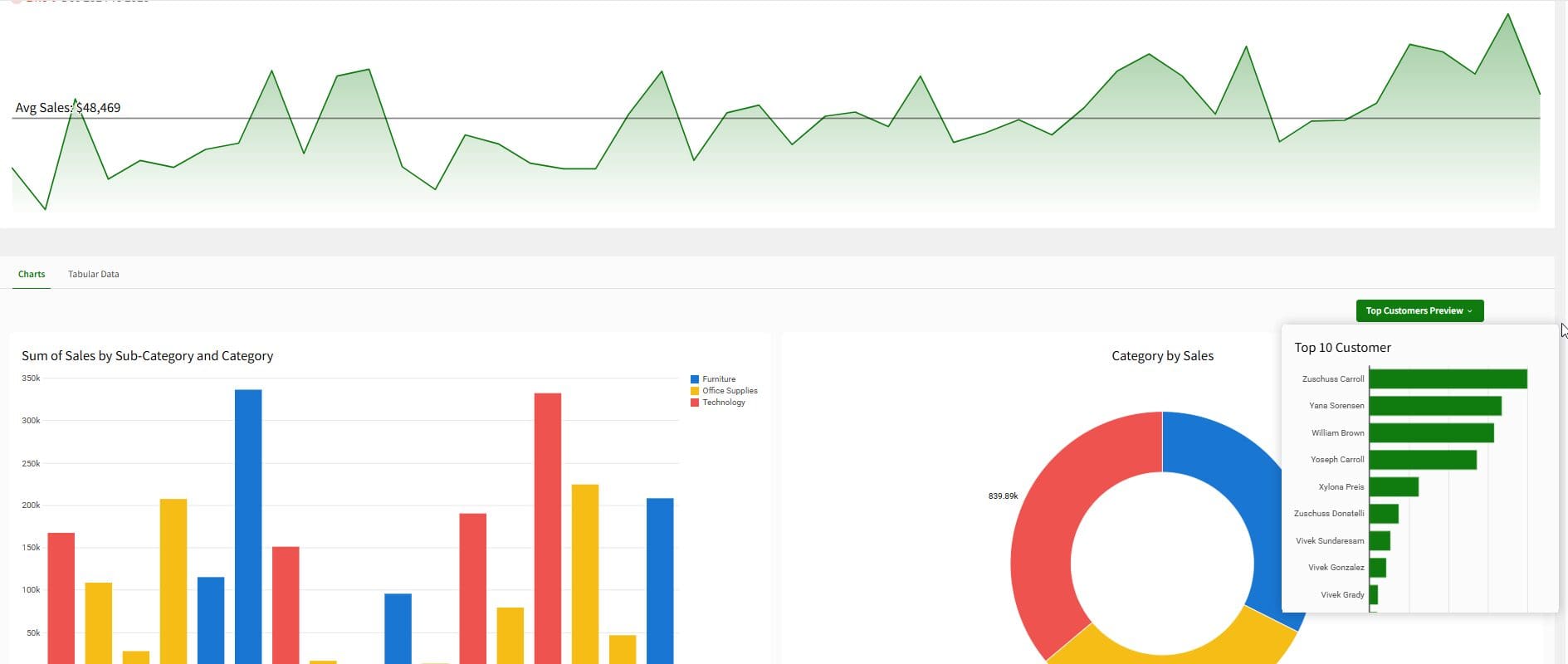
Popovers
Smaller, anchored layout elements used to group filters or controls, which help maintain a clean dashboard design. Modals are page-like overlays that demand user focus for a specific workflow, while popovers are smaller, less-disruptive, contextual overlays that are anchored to a specific trigger button.
Popovers, as the name implies, are also overlays, but do not draw as much attention from the viewer in the same way the Modal does.
When the Popover button is clicked, a small window appears beside the Donut chart to display additional information, without disrupting other dashboard elements.
Closing
Sigma Computing has fundamentally changed how dashboards are designed and experienced. The platform’s flexible grid system and responsive container models accommodate dashboards that are compelling, easy to use, and, above all, data-driven, with interactive layout elements like modals and pop-overs that can be created in minutes.
The takeaway is that Sigma is no longer a single, limited “layout option,” rather it is a framework that is powerful, modular, and responsive to the ways in which teams communicate and present data.
Now that you know the possibilities for different dashboard layout options in Sigma, try using containers, tabbed layouts, and modals in your next dashboard. You may be surprised how easily you are able to create compelling data stories and present complex data, while still providing a clean, interactive, and engaging experience for end-users.
Looking for help from the experts?
Contact phData to review your dashboards, recommend layout improvements, or build a tailored Sigma prototype to accelerate your next release.
How do I determine what layout element to use when designing a Sigma dashboard?
Begin with the Grid layout as your base, as it guarantees alignment and responsiveness. Use Containers to group visuals of related context together, Tabbed Containers to categorize visuals by similarity, and Modals as a focused experience that looks like an app. Use Popovers for filters or small actions that do not add clutter to the primary view. It is up to you how you want your users to explore and interact with the data.
Can I change the layout for an existing Sigma dashboard?
Yes. While Sigma does not offer an instant option for converting layouts, you can easily structure your existing content with containers and grid settings. You can copy the previous elements into a new workbook or layout, so you have more granular control of the responsiveness and organization. It’s a fantastic way to refresh an older dashboard with the latest Sigma design features.


