This dashboard provides users with a clear and straightforward overview of how sales perform against their assigned quotas. It offers insights for a specific date and time range within the current year and compares this performance to the same period in the previous year. Users can easily spot and analyze year-over-year differences in sales compared to quota across various dimensions.
Who Is This Dashboard For?
This dashboard is meant for the sales team director/manager or any other sales member who wants to see the sales performance in relation to quota. It serves as a valuable tool for identifying which dimensions need to meet their quota. Offering this insight assists in setting realistic expectations and enables the strategic reallocation of sales efforts to improve overall performance.
What You Can Accomplish With This Dashboard
With this dashboard, you can see the performance of each Business Unit or dimension in terms of sales compared to their respective quotas for both the current and prior years. Within the entire workbook, you have the flexibility to select different time frames, including Month-to-Date, Quarter-to-Date, and Year-to-Date, starting from the beginning of your chosen period up to the specified date.
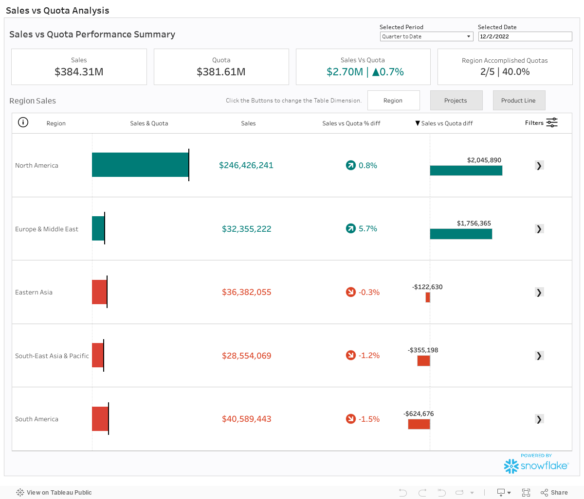
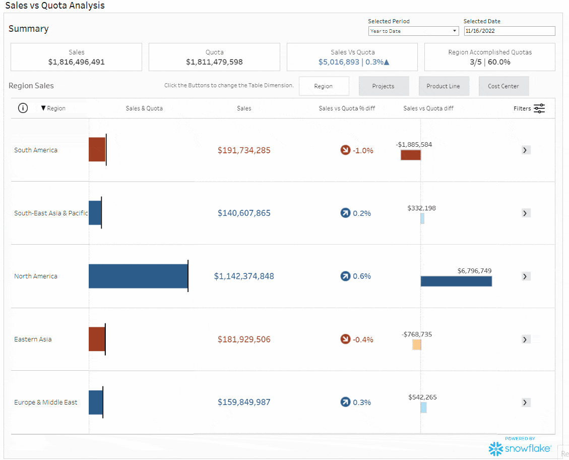
Summary
The summary dashboard offers a comprehensive view of sales and quota performance for the chosen period. It presents sales and quota figures data, including the dollar amount and the percentage difference between them. It also provides insights into the number of Business Unit dimensions that have achieved their quotas.
Within the table section, users have the option to switch between Business Units (BUs) using dedicated buttons. The table offers various filters for more focused data exploration. Moreover, users can sort the table by clicking on the headers, allowing for ascending and descending order.
Each row in the table includes a gray box with an arrow that, when clicked, directs users to detailed information specific to that particular dimension.
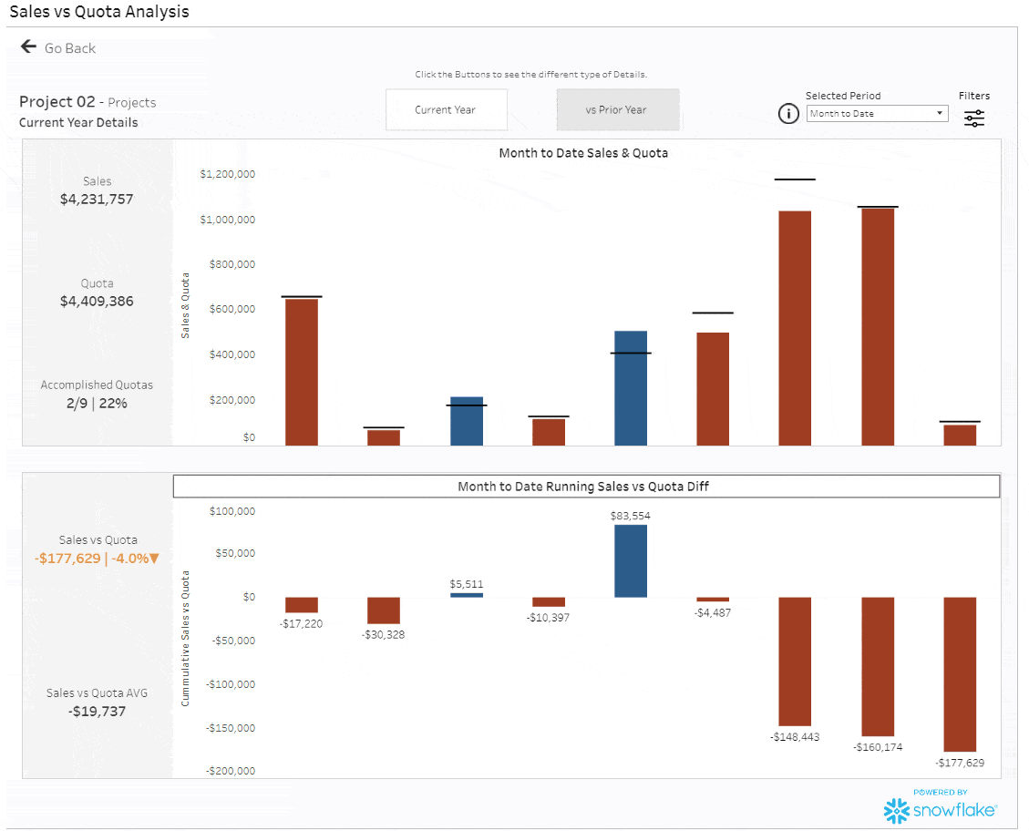
Details
The details dashboard is designed to provide specific data for your chosen dimension. It offers two types of details: Current Year and vs. Prior Year. Within each type, you have the flexibility to select the desired time period and apply relevant filters
Note: When Year-to-Date is selected, each bar represents a month. When Quarter-to-Date is selected, each bar represents a Week. When Month-to-Date is selected, each bar represents a day.
Current Year
In the Current Year section’s top segment, you’ll find a visual representation of Sales (displayed as bars) and Quota (indicated by a reference line). Sales that have met their Quota are depicted in blue, while unmet Quotas are highlighted in a dark red color.
The bottom portion of this section illustrates the cumulative sum of the Sales versus Quota Difference, with the same color-coding applied to the bars.
Note: The tooltips provide additional information, including Sales, Quota, the dollar difference, and the corresponding date.
Vs. Prior Year
The vs. The prior Year Detail type is designed to compare current-year sales with the same period in the previous year. In the top section, you’ll find key performance indicators (KPIs) such as Sales (including the YoY change), Quota, and Sales vs Quota (also showing the YoY change) on the left. The bar chart visually represents the percentage difference between Sales and Quota, and tooltips provide detailed information on Sales and Quota and their difference for the current year.
The bottom section is very similar to the top section, with the distinction that it displays details from the prior year for the selected period, allowing for a meaningful year-over-year comparison.
Developer Note: The dashboard employs a dynamic zone visibility swap between Current Year and vs. Prior Year to enhance the overall design and performance of the entire workbook.
Conclusion
We hope you found this dashboard useful in your pursuit to identify and better/understand how the Sales are performing, which BUs or dimensions can accomplish the Quota, and how the trends are going for the current year.
If you have any questions, need help, or are interested in having a team of Data experts design any kind of dashboard for you, feel free to reach out!