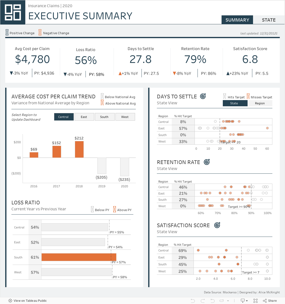
This Tableau Insurance Claims dashboard provides users an end-of-year summary of five key insurance KPIs. The KPI cards at the top of the executive summary view show year-over-year growth and the previous year’s value.
The user can also see a five-year variance trend of average cost per claim, current year vs. prior year loss ratio by region, and how each region and its states are performing vs a user-selected target for the following KPIs: days to settle, retention rate, and satisfaction score.
The state view shows a similar breakdown of each KPI on the state level. Also included are key demographics for the selected state. National ranking, region ranking, and percentile for each KPI can also be viewed.
About the Data
This dashboard is built using sample data generated by Mockaroo. The dataset contains state-level data for each KPI for the years 2020 and 2019. Demographic data includes gender, type of vehicle use, coverage type, and average income.
Who is the Ideal User of This Dashboard?
This dashboard is meant for insurance regional managers and executive-level leadership who require a higher level end-of-year summary of key metrics. The dashboard allows users to quickly identify regions and states that are underperforming (indicated by the orange color) vs the prior year or are not hitting specified targets.
What You Can Accomplish With Dashboard
Summary View:
KPI Cards: Each card shows the current year’s value, year-over-year change, and the previous year’s value.
Average Cost Per Claim: This section of the dashboard shows the variance between the national average cost per claim and the regional average cost per claim. Years, where the regional average is above the national average, are colored orange.
Loss Ratio:This chart shows the current value vs the previous year’s value by region. Orange indicates the current year’s ratio is higher than the previous year.
Days to Settle, Retention Rate and Satisfaction Score: These three sections show each measured value against a user-selected target. Targets can be adjusted by clicking on the target icon and typing a value. The user can also toggle between and region or state level of detail. Regions/States not meeting the defined target are colored orange.
State View:
Demographics Panel: This section of the dashboard shows the distribution of each demographic across the selected state.
State Performance Panel: This section displays one of the previous KPIs’ performances on the state level. The colored bar indicated the percentile the selected state falls under for the metric: top, middle, or bottom third which provides the user with a quick indicator of the state’s performance. Each panel shows the national ranking and region ranking of the state, current value, year-over-year change, and previous year’s value. Lastly, a five-year trend line chart shows the state’s average vs. the national average.
Conclusion
We hope you found this dashboard useful to quickly identify regions and states that performing below expectations within your company. If you have any questions, need help, or are interested in having a team of Tableau experts design dashboards for you, feel free to reach out!