Nothing has left an indelible mark on the global economy in the past 40 years like COVID-19. While COVID has had broad-based effects on the economy, many of these effects are based on disease progress at the local level. The goal of this dashboard was to create a dashboard to be embedded on a website for local analyses.
Who This Dashboard is For?
This dashboard is designed for a public audience whose location could be anywhere in the United States. This means that a user, regardless of location, must be able to navigate to the county of interest quickly.
What You Can Accomplish With Dashboard
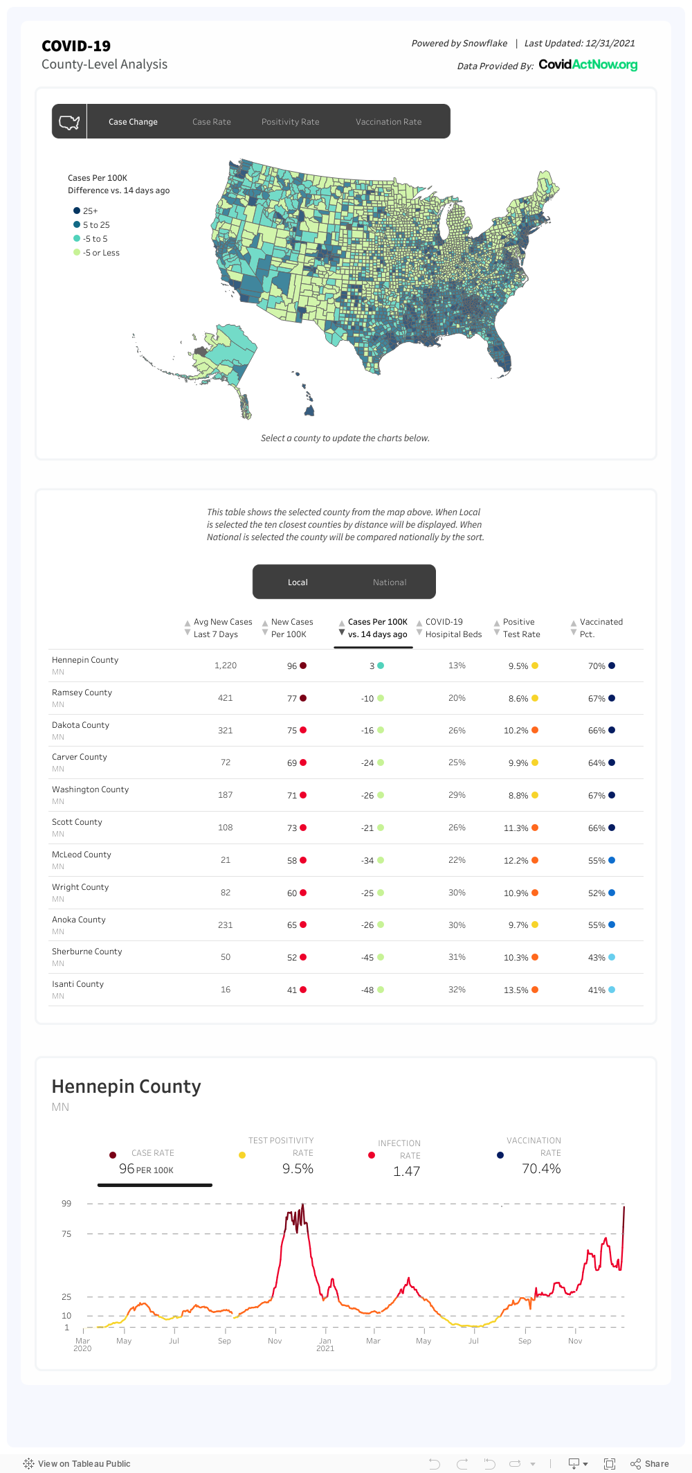
This dashboard is designed with three levels in mind. First, how does any county in the United States compare to any other county on one of four metrics: case rate, positivity, rate, vaccination rate, and change in cases.
On the map, you can select a county. This will update the charts below.
Below the map is a table showing county-level information. This table either shows the selected county compared to surrounding counties or versus national–depending on the selection and sort.
The final part of the dashboard shows the values over time for the selected metrics. This final example is all completed using a single sheet and map layers.
Conclusion
We hope you found this dashboard useful in your pursuit of COVID-19 trends by county. If you have any questions, need help, or are interested in having a team of Tableau experts design dashboards for you, feel free to reach out!