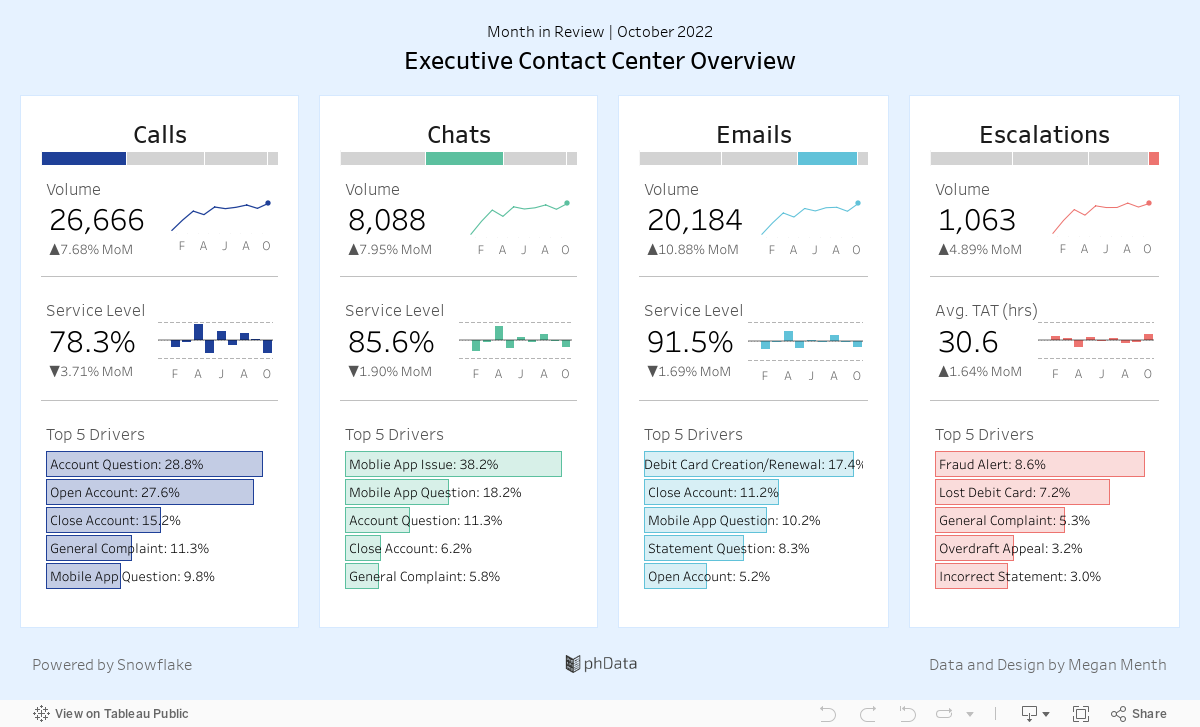
This Tableau dashboard shows a high-level summary of a contact center’s various channels (call, email, chat) volume and performance, as well as escalation information and contact drivers.
This executive summary shows the final step of a data process that may use analytics engineering or data engineering to push data from a source system to the Snowflake Data Cloud, and then to Tableau.
In this case, data from a phone system (calls), a CRM (emails, escalations), and other third-party data sources (chats) are blended together to form one coherent and streamlined dashboard.
About the Data
The data for this dashboard comes from three source systems, is prepped and blended together using Alteryx, and stored in Snowflake for Tableau consumption. The below diagram shows how this data flows from source to dashboard. All data for this was randomly generated and does not represent a real company.
Who is This Dashboard For?
This dashboard is meant for executives and contact center managers that are looking for a high-level idea of how customers are contacting them, the trend of these contacts, and the top reasons customers are contacting. They should be able to use this dashboard to see if something unexpected is happening in the contact center and to identify potential areas to target for contact deflection, product improvement, or service improvements.
What You Can Accomplish With Dashboard
This dashboard is intentionally designed to be simple, with no need to filter, drill down, or even hover–although tooltips are available and give some additional insight by providing exact figures. This dashboard would be an ideal candidate for setting up an automated alert when the data refreshes with a screenshot image in an email or slack message.
It is perfect for busy executives who do not have a lot of time to navigate Tableau Server but prefer to get alerts at a particular time or when the data refreshes.
Conclusion
We hope you found this dashboard useful as an example of how to bring several disparate data sources together into one streamlined dashboard. If you have any questions, need help, or are interested in having a team of Tableau experts design dashboards for you, feel free to reach out!