

Network visualizations display relationships between elements by linking nodes with common characteristics. This allows the user to visualize clusters quickly and determine relationships. Unfortunately, the development process in Tableau isn’t as straightforward. To get the data into a Tableau-friendly format for network visualization, we’ll first do some data preparation then bring it into Gephi to produce spatial coordinates.
This example is expanding on the blog published by The Data Surfers. I’ll be showing the steps in both Python and Excel. I prefer Python, but either (or a tool of your choice) should produce the same result.
Prepare a Dataset Capable of Creating Network Visualizations
To accomplish this, you’ll need a dataset capable of showing a network of relationships. In this example, I’ll be using Harry Potter screen time statistics gathered from IMDB. This allows us to link each actor to the movies they appeared in. I’ll be referring to this as the main dataset.
If you’d like to follow along with the same data, do it! I even cleaned it up a bit for you; thank me later.

To prepare the data for Gephi, we need to create two CSV files: nodes and edges.
Prepare Data for Gephi: Create a CSV Nodes File
The nodes file will contain three columns:
- ID: a unique identifier for each label
- Nodes: a unique identifier to create each node
- Label: a list of all unique values of the two columns you’re visualizing (in my case: Actors and Movies)
Python
# 1. Read in the main dataset
import pandas as pd
import numpy as np
main = pd.read_csv(yourfilename)
# 2. Take a unique list of the two network columns (Actor and Movie)
movies = main.Movie.unique()
actors = main.Actor.unique()
# 3. Concatenate the two list into one array
label = np.concatenate([movies, actors])
# 4. Create the nodes dataframe from the label array
nodes = pd.DataFrame(label, columns = [“Label”])
# 5. Add the ID and Nodes unique identifier columns
nodes[“ID”] = range(1, 1 + len(nodes))
nodes[“Nodes”] = range(1, 1 + len(nodes))
# 6. Export the nodes dataframe as a CSV
nodes.to_csv(‘nodes.csv’, index = False)

Excel
- Create a new sheet named nodes
- Create three columns “ID,” “Nodes,” and “Label”
- Copy the Movies column from main and paste it under “Label”
- Copy the Actors column from main and paste it under “Label” below the Movies values
- Select the entire “Label” column and remove duplicates
- Data – Data Tools – Remove Duplicates
- Create a unique ID and Node for every value in “Label”
- Make sure the “ID” and “Node” columns are identical
- Save the sheet as a CSV
Prepare Data for Gephi: Create a CSV Edges File
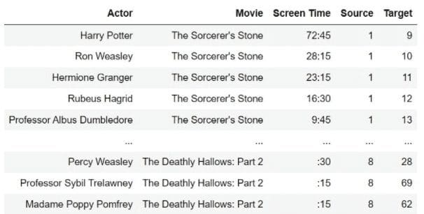
Before we attack the edges file, let’s add two columns to the main dataset: “Source” and “Target.” We’ll use the nodes file to get the unique ID of both the Actor and Movie labels. The “Source” value will contain the Movie ID and “Target” the Actor ID.
Python
# use the map() function to add the columns with data from nodes
main[“Source”] = main.Movie.map(nodes.set_index(‘Label’)[‘Nodes’].to_dict())
main[“Target”] = main.Actor.map(nodes.set_index(‘Label’)[‘Nodes’].to_dict())
I found this article helpful in implementing .map()
Excel
Use the Index Match function combination to transfer the IDs from the nodes to the “Source” and “Target” columns.
Here’s a helpful article on using Index Match
Build the Edges Dataset
Ok, now we’re ready to build the edges dataset.
The edges file will contain four columns:
- Source: The unique Movie ID from the main dataset
- Target: The unique Actor ID from the main dataset
- Type: “Directed,” which tells Gephi that edges can have a direction. If you’d like to read further into it, here ya go.
- Weight: “1,” which tells Gephi the total connections between Source and Target. Again, if you’d like to read further into it, have at it.
Python
# 1. Grab the Source and Target columns from main
edges = main[[“Source”, “Target”]]
# 2. Add the Type and Directed columns
edges.insert(2, ‘Type’, “Directed”)
edges.insert(3, ‘Weight’, 1)
# 3. Export the edges dataframe as a CSV
edges.to_csv(“edges.csv”, index = False)
# 4. Export the main data frame as a CSV
main.to_csv(“main.csv”, index = False)
Excel
- Create a new sheet named edges
- Copy the “Source” and “Target” columns and paste them into the edges sheet
- Create a column named “Type” and populate every row with “Directed”
- Create a column named “Weight” and populate every row with “1”
- Save the edges sheet as a CSV
- Save the main sheet as a CSV

Loading Data into Gephi
We now have all the data necessary for Gephi. If you haven’t already, install the free software.
When loading the software, I got an error “Cannot find Java 1.8 or higher”. This site helped resolve it. To summarize, add a new line to the top of the gephi.conf file directing it to your instance of Java (ex. jdkhome=”C:/Program Files (x86)/Java/jre1.8.0_291″)
Let’s start loading some data.
- Click File – Open and select your nodes CSV file
- Gephi should recognize this as a Nodes table
- Click Next – Finish
- Change Graph Type from Mixed to Directed
- Click OK
At this point, you should see an array of nodes that appear randomly distributed in your workspace.

Let’s input the edges file (a very similar process)
- Click File – Open and select your edges CSV file
- Gephi should recognize this as an Edges table
- Click Next – Finish
- Change Graph Type to Directed
- Select “Append to existing workspace”
- Click OK

We’re getting somewhere! It’s time to utilize the Layout dropdown to format our network.
I recommend going through each layout and altering its preset properties until you find one that meets your needs. I ended up using the Yifan Hu Proportional.
Once you’ve selected a layout, you can manually move nodes using the drag tool (select Configure to change the diameter of your cursor).
To export the coordinate data, select File – Export – Graph File and save the file as a .gexf

Final Data Prep
We’re almost to Tableau, I promise. To extract the coordinates, we must open the .gexf file as an XML table. I found this easiest to implement in Excel.
- Open an empty Excel sheet
- Click File – Open and navigate to the .gexf file you just created
- Make sure that “All Files” is selected from the file search dropdown
- Make sure that “All Files” is selected from the file search dropdown
- Select the .gexf file and click Open
- When prompted to select how to open the file, choose “As an XML table”
You’re looking at something like this, right?

Perfect. We’ll call this new table network. The only columns you’ll need from network are “label,” “value,” “x,” and “y.” Do what you wish with the remaining columns.
The goal is to transfer the x and y values to our main dataset using the unique ID of each node. Notice the “value” column for each label in the network sheet corresponds to the “Source” and “Target” columns in the main dataset.
For the links in the network visualization, we need to create two nodes for each source and target combination in the main dataset. (ex. one at Harry Potter and one at The Sorcerer’s Stone)

Python
Save the network table as an .XLSX file.
# 1. Read in the main dataset
main = pd.read_csv(“main.csv”)
# 2. Read in the network dataset
network = pd.read_excel(“network.xlsx”)
# 3. Merge the ‘x’ and ‘y’ coordinates corresponding to the “Target” value for each main dataset combination. Save this as a new dataframe
target = main.merge(network[[‘x’, ‘y’, ‘value’]], how = ‘left’,
left_on = ‘Target’, right_on = ‘value’).drop(columns = [‘value’])
# 4. Merge the ‘x’ and ‘y’ coordinates corresponding to the “Source” value for each main dataset combination. Save this as a new dataframe
source = main.merge(network[[‘x’, ‘y’, ‘value’]], how = ‘left’,
left_on = ‘Source’, right_on = ‘value’).drop(columns = [‘value’])
# 5. Append the source data to target and save it as main
main = target.append(source)
# 6. Export main as a CSV
main.to_csv(“main.csv”, index = False)

Excel
- Make a copy of the main sheet
- In the original sheet, use the Index Match function combination to match the Target value of each pair with its corresponding x and y coordinates.
- ex. = INDEX(array of x coordinates, MATCH(label in main, array of labels in network, 0))
- In the copy of the sheet, use the same function combination to match the Source value of each pair with its corresponding x and y coordinates
- Copy and paste all the data in the second sheet (the source value coordinates) under the data in the original sheet (the target value coordinates).
- Delete the second sheet and save
Connect to Main Dataset in Tableau
About time, right? Now, all you’re going to need is your main dataset. Once you’ve connected to the main dataset, in a new sheet, create a dual-axis chart using the X and Y coordinates.

- Add X to columns
- Add Y to rows twice
- Note both the X and Y variables must be continuous dimensions
- Right-click on the second Y variable and select “Dual Axis”
- Right-click on either Y-axis and select “Synchronize Axis”
- Set the first value on the Marks card, Y, to Line
- Set the second value on the Marks card, Y (2), to Circle

Select All on the Marks card and add Source and Target to detail as continuous dimensions.

Bingo.
I’ll leave the design decisions up to you, but this was the process I used to create the Network Visualization – Harry Potter dashboard.


