When it comes to data visualization, the standard Power BI card does a lot of the heavy lifting. It is reliable, easy to use, and gets the job done. However, as dashboard design evolves toward more sophisticated, web-like experiences, the limitations of standard visuals become apparent. Using customize HTML cards was key to improving usability for a stakeholder’s report, where a default Power BI Card visualization couldn’t show more information.

The Design Challenge
Initially, we implemented a standard Power BI card to display key metrics. However, the requirement evolved to present more detailed contextual information, which the default Power BI card could not accommodate effectively without becoming visually cluttered. Consequently, we explored an alternative solution utilizing an HTML-generated card to meet this need for enhanced information display.
Our approach involved leveraging the existing Power BI card design and instructing an agent to generate a corresponding HTML card, maintaining the same aesthetic, color palette, and formatting. Crucially, we incorporated a ‘hover’ feature: a secondary card that appears upon user interaction (hovering over the main card), providing supplemental, in-depth context related to the displayed metric.
HTML Card Maintenance
One of our biggest concerns was how a user would keep this card functioning, as it is a huge code in HTML using CSS for styling and animations, something not everyone is familiar with. Below, we have an example of a simple card in HTML, which by itself already seems quite complex for most Power BI developers.
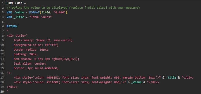
The measure above generates a card identical to the picture below.

Even though it is a small measure, maintaining an HTML card is complex, especially if it has customizations and animations in CSS, as was our case.
For this, we thought of a way to structure the maintenance of the measure in HTML so that any user could manage it, adding or removing the number of cards easily, without needing to know how to program in HTML or CSS.
HTML-Driven Scalability
The most elegant solution is to treat your dashboard cards like a web application. By using a specialized HTML Content visual and a single DAX measure, we can render high-fidelity cards using CSS and HTML. But the real “magic” lies in making this system dynamic.
To start, I asked a model to generate a Power BI Card in HTML, using CSS for a custom appearance and making it the most dynamic possible. I also used a print of my Power BI default card for AI to use as a guide.
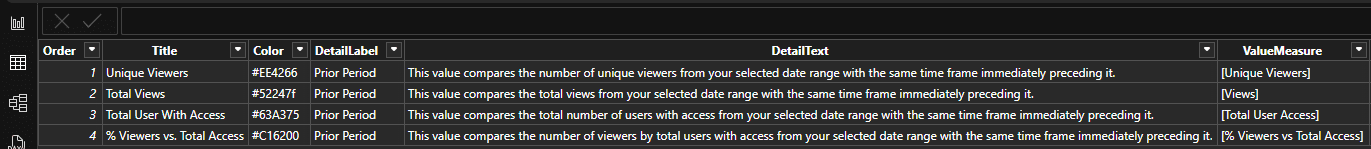
Instead of hardcoding the HTML for each card, we use a Configuration Table (e.g., CardsConfig). This table acts as the brain of your dashboard, containing metadata for every card you want to display, for example:
| Column | Description |
|---|---|
Order | Determines the sequence of cards on the screen. |
Title | The display name of the metric. |
Color | The hex code for the card’s accent color. |
DetailLabel | The title or label shown within the hover card. |
DetailText | The explanatory text that appears when a user hovers over the card. |
ValueMeasure | A string reference to the DAX measure for the main value. |
This is the configuration table that I have in Power BI that works as a brain for my HTML measure
The initial setup requires the user to configure a settings table, define DAX measures, and install the HTML engine visual from the Power BI store.
To update existing cards, simply modify the configuration CardsConfig table. To create a new card, a new row must be added to the configuration table, and the corresponding DAX measures must be mapped to the main HTML measure.
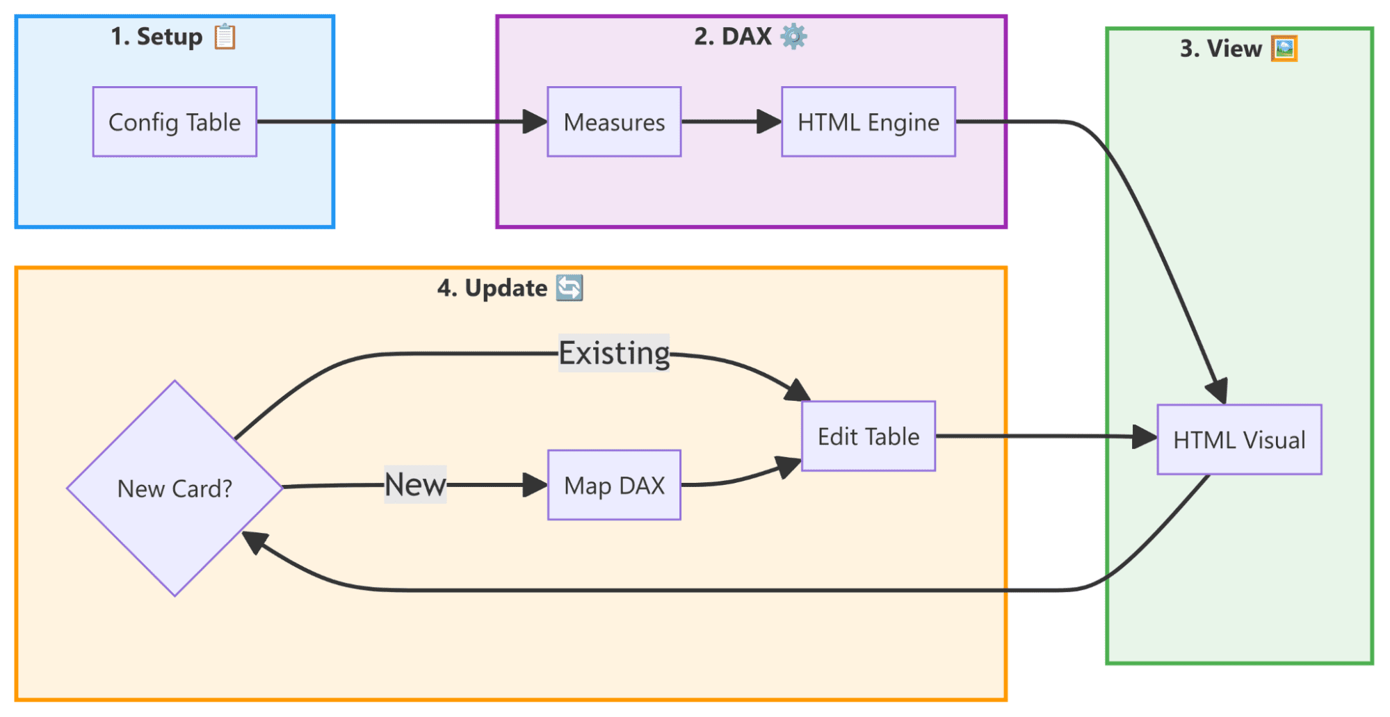
The Building Blocks: Measures
To demonstrate the versatility of this approach, here are some of the DAX measures used in our example. These are generic metrics applicable to any org, organized by their role in the dashboard.
Main Value Measures
These measures represent the primary data shown on the front of the card.
					-- Counts the number of distinct users, providing a clear view of unique audience reach.
Unique Viewers = DISTINCTCOUNT('FactTable'[UserID])
					-- A simple count of rows to measure the total volume of interactions or events.
Views = COUNTROWS('FactTable')
					-- Monitors the total number of users who have permission or have accessed a specific resource.
Total User Access = DISTINCTCOUNT('AccessTable'[UserID])
					-- A ratio measure indicating engagement or adoption rates.
% Viewers vs Total Access =
DIVIDE(
    [Unique Viewers],
    [Total User Access],
    0
)
Icon Measures (SVG)
These measures return the raw SVG code for the icons used in each card.
					-- SVG for the 'Users' icon, representing total users with access.
C1_IconSVG =
    "<svg xmlns='http://www.w3.org/2000/svg' width='24' height='24' viewBox='0 0 24 24' fill='none' stroke='currentColor' stroke-width='2' stroke-linecap='round' stroke-linejoin='round' class='feather feather-users'><path d='M17 21v-2a4 4 0 0 0-4-4H5a4 4 0 0 0-4 4v2'></path><circle cx='9' cy='7' r='4'></circle><path d='M23 21v-2a4 4 0 0 0-3-3.87'></path><path d='M16 3.13a4 4 0 0 1 0 7.75'></path></svg>"
Measures that return a string containing <svg>...</svg> code allow for pixel-perfect, vector-based icons that scale without losing quality.
How the Dynamism Works
The heart of this system is a DAX measure that uses the CONCATENATEX function. This function iterates through the CardsConfig table, injecting the metadata into a pre-defined HTML/CSS template.
This architecture solves the scalability problem. If your stakeholders want to add a fifth or sixth metric, you don’t need to resize visuals or copy-paste code. You simply update your configuration table, and the DAX measure automatically generates the new card, perfectly aligned and styled.
Maintaining the System
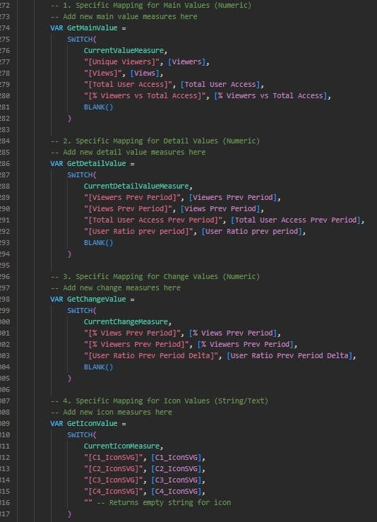
One of the biggest hurdles in dynamic DAX-HTML systems is evaluating measures stored as text strings. Since DAX cannot natively “execute” a string as a measure, we implement a robust mapping system using SWITCH.
This mapping ensures that when the configuration table asks for any measure, the DAX engine knows exactly which numerical measure to evaluate. While this requires a one-time setup for each new metric, it provides a secure and predictable way to maintain the dashboard.
This is where the user needs to update the CardsConfig table to add or remove cards.
Conclusion
Building dashboards with dynamic HTML cards transforms Power BI from a simple reporting tool into a powerful platform for data storytelling. It allows designers to create pixel-perfect interfaces that are not only beautiful but also incredibly easy to maintain and scale.
Whether you are building an executive summary or a complex operational tracker, the combination of HTML flexibility and DAX logic is a game-changer for modern data professionals.

Ready to level up your Power BI experience?
Reach out to phData to explore how our experts can help you design scalable, HTML-powered dashboards tailored to your organization.