This Telco Operations Performance Tableau Dashboard shows operation KPIs split by the primary Phone Types utilizing the network. Take analysis a step further and begin to explore all the cell towers on the network and how they are performing within a given time frame.
This dashboard uses ‘Positive’ and ‘Negative’ indicators for quick identification of performance and customizable KPI selections to put control in the hands of the user.
Who is the Ideal User of This Dashboard?
This Telco dashboard is designed for an operations manager or support team to get a high-level overview of operation KPIs within a chosen time frame and understand how the main phone carriers and cell towers on the network influence those metrics.
These insights will allow the users to answer questions from leadership about KPI performance and identify areas of concern for the operations team.
What You Can Accomplish With This Dashboard
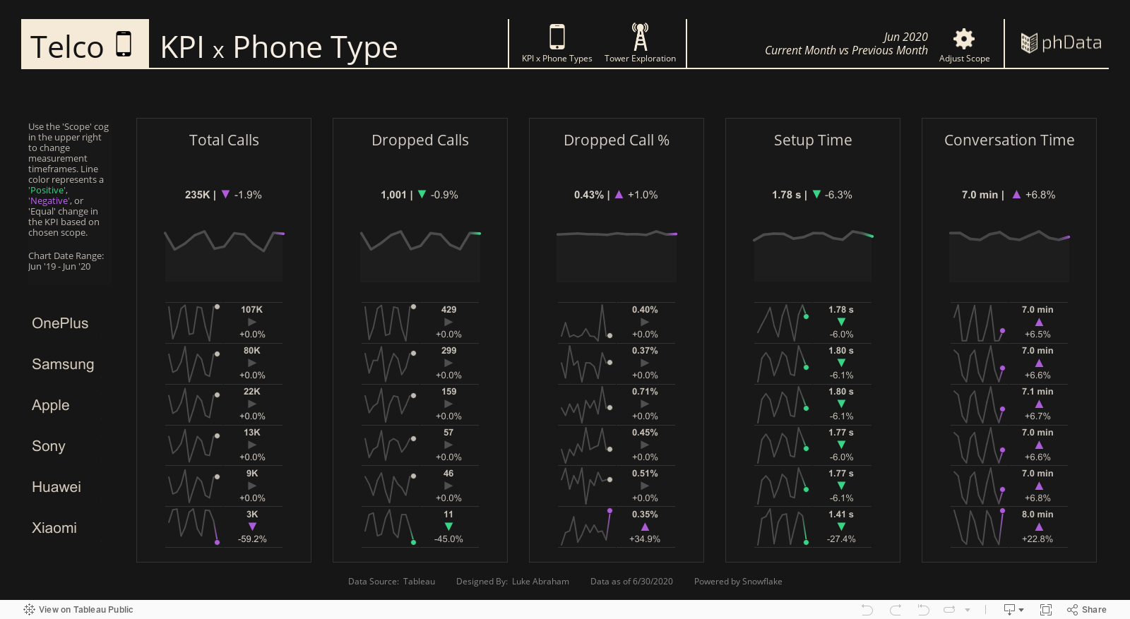
KPI x Phone Types - View 1
Date/Scope Adjustment: Click the “cog” icon to adjust “Performance Scope”–Current Month, Current Quarter, Current Year–and how those compare to a previous time frame.
Performance Indicators & Color Highlights: Quickly identify ‘Positive’ or ‘Negative’ changes in performance by using up/down arrows and color assignments.
Navigation Icons: Click the Phone or Tower icon above to navigate to either the ‘KPI x Phone Types’ or ‘Cell Tower Exploration’ views.
Tooltips: Hover over data points to see specific values.
Cell Tower Exploration - View 2
Date/Scope Adjustment: Click the “cog” icon to adjust “Performance Scope”–Current Month, Current Quarter, Current Year–and how those compare to a previous time frame.
Build Your Own Scatterplot: A scatterplot of Cell Towers. The user can select the KPI they would like to apply to the X or Y-axis. Tooltips allow the user to see high-level KPI values of the specific Tower. The top 10 for each KPI are given a specific color for quick identification.
Tower Lists: Depending on your chosen KPI, a list of all towers, Highest to Lowest by metric, will populate. Each entry includes a sparkline for historical reference, a highlight representing the chosen scope time, and a label to quickly see the scope value, positive/negative change, and % change. Clicking a cell tower (or many) on the scatterplot will filter these lists to just populate the chosen towers.
Select/Filter specific Towers: On the scatterplot, click, ctrl-click, or drag the cursor to multi-select towers and have them populate the tower lists on the right side of the dashboard.
Navigation Icons: Click the Phone or Tower icon above to navigate to either the ‘KPI x Phone Types’ or ‘Cell Tower Exploration’ views.
Tooltips: Hover over data points to see specific values.
Conclusion
We hope you found this dashboard informative as you monitor KPIs for Phone Types and Cell Towers. The information provided should allow you to answer questions from leadership about how KPIs are performing within the operation, as well as internally identify areas of concern.