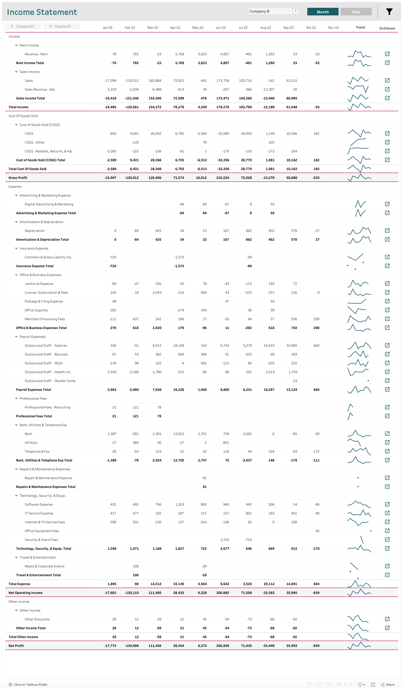
This Tableau income statement dashboard gives users the traditional spreadsheet type of view into accounts, while also allowing for increased flexibility and dynamism. Users can toggle between different companies or departments, toggle between a monthly and yearly view, and also collapse or expand account categories to either show or hide details.
Who is This Dashboard For?
This Tableau income statement dashboard is designed for anyone who uses a traditional income statement, be it accountants, company leadership, board members, etc. This dashboard is particularly useful for companies that might have several companies that need to roll up into a single income statement.
3 Key Features About This Income Statement Dashboard
1. Data Model
This dashboard uses a complex data model and data densification that is best supported through an analytics engineering tool. This data model was built in Alteryx, which allows for the process of updating the dashboard to be completely automated. The data model here is needed in order to accomplish the following:
To allow for different schemas depending on the company selected
To allow for helpful formatting (some rows bolded, some indented, some can be collapsed and expanded, some rows have lines or are shaded)
To ensure the account information shows up in the correct order
2. Collapse/Expand Logic
This income statement has three hierarchical levels: the account category (e.g. Income), the account type (e.g. Sales Income), and the account description (e.g. Sales). The account description level can be hidden altogether by clicking the ‘Collapse All’ button, or individually by clicking the arrow on each account description’s account type.
Similarly, all account descriptions can be shown by clicking the ‘Expand All’ button, or by clicking individual account type arrows. When an account description is collapsed, the account type’s subtotal is listed on the same line as the account type header. However, when an account description is expanded, a subtotal row also appears (bolded) after listing out all account descriptions.
3. Other Functionality
The user also has the ability to toggle between a monthly view that looks at the current or most recent year, and a yearly view that shows the last three years. When the monthly view is selected, the user can filter out specific months using the filter icon, and when the yearly view is selected, certain whole years can be filtered in or out.
This dashboard also has some helpful features on the right-hand side of the statement, including sparklines to highlight trends, and a pop-out button that could lead to a more detailed account view (these buttons are not functional for this example).
In Summary
We hope you found this Tableau income statement dashboard example useful in showing how an income statement can be made more dynamic, flexible, and user friendly.